
In the past decade, data analysis and visualization have become some of the most valuable assets for many organizations. These organizations generate large amounts of data daily and use it to inform new strategies, such as entering new sales channels and launching new products. Admin dashboards are a great way to analyze data quickly and effectively. These dashboards collect and provide real-time data from your website or software to help employees make informed decisions for the organization.
Plotly Dash is a popular tool that is used to create an admin dashboard for data exploration, visualization, and more. It is a low-code framework for creating dashboards with programming languages like Python. Dash is built on top of Plotly.js and React.js and can be installed on virtual machines (VMs) or Kubernetes clusters and shared via URLs. Dash is released under the MIT License, which makes it free to use.
In this article, we'll walk through what Plotly Dash is, its various use cases, and how to build a dashboard using Plotly Dash.
What is Plotly Dash?
Plotly Dash uses apps to show explanatory plots and reports on the web so that businesses can make informed decisions. These apps have two different components that determine their look, feel, and interactivity:
- Layouts include text, graphs, buttons, sliders, and many more HTML-related elements. Layouts let you decide the size, color and look of the data presented. While deciding how to display various types of data might be difficult, Dash makes it easier to arrange them by providing HTML components.
- Callbacks introduce interactivity to the web dashboards. Callbacks are automatically called by a Dash app and change the output object property whenever there is a change to the input object property. For example, you can use callbacks to make buttons or dropdown menus that show specific data in the dashboard. Once you select an item from the dropdown menu, data will be filtered out based on the logic that you defined in the backend.
Plotly Dash use cases
Now that we've discussed what Plotly Dash is, let's move on to its use cases:
- Data visualization: Plotly Dash allows users to create graphs and plots in a dashboard format to visualize large quantities of data, which would be impossible to analyze in its raw format.
- E-commerce: Plotly Dash users can create responsive dashboards to analyze e-commerce trends and user behavior, including customer purchase patterns, customer churn patterns, payment-related information, etc.
- Sales dashboards: Plotly Dash can be used to create sales dashboards to help organizations gain real-time insights into various sales categories (e.g., sales by region, date, time, etc). These insights help sales teams make informed decisions for the organization.
Building a dashboard using Plotly Dash in Python
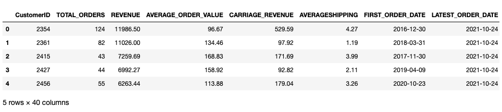
This tutorial demonstrates how to use Plotly Dash to build a Python dashboard for sales and revenue data. The data set used for this tutorial is from Kaggle and can be found here. This data set contains information such as customer ID, total orders, orders based on the day, and revenue.
In this guide, macOS is used for the overall code development, but the setup process is similar for other types of operating systems.
Prerequisites
For this tutorial, ensure you have the following:
- Python 3.9.0 for development
- Jupyter Notebook for writing and executing code
- A MySQL database for storing and querying the data
Note that you can use any database for storing and retrieving data, but you will need to install the associated Python dependency. This tutorial uses MySQL, and you can follow this link for more information on downloading it and setting it up.
Since we'll be using Jupyter notebooks for development, we'll need to install Dash dependencies. These dependencies can be downloaded using the Python package manager (pip). You can either use the command prompt or Jupyter Notebook itself to download the libraries.
Let's use the following command to install the MySQL Python library for interacting with the database:
Next, install the Python Dash dependencies needed for creating the interactive admin dashboards:
Then install additional Python libraries needed for processing:
Filling the database with orders data
Let's start by creating a table in the database and populating it with the revenue data. We can either use the MySQL command line interface or the Python-MySQL client to do so. Although the same commands are used for both, inserting data from a CSV file into the database is quite easy with Python.
Loading the dependencies
The process of storing data through the Python-MySQL client starts with loading the dependencies and reading the data set:
The output of the code above looks like this:
Creating a connection to MySQL
Once the data set is loaded, the next step is to create a connection to the MySQL database:
The connector module is used to establish a connection to MySQL. This function requires the following details:
- Define a
hostto connect to; if you are working in the local environment, then the host would belocalhost - Define the
user; generally, this user is configured asroot - Assign a
passwordfor the defined user - Select a
databasewhere you will create the table. If you want to create a new database, you can use theCREATE DATABASE DB_NAMEcommand
Creating a table in the database
Once the connection is established, let's create a table using the CREATE TABLE command to store the revenue data.
Do this using the following code:
To perform any operation on a database such as insert, update, and delete, create a cursor and use the execute() function to run a query.
Inserting data in the database table
To store the data in this database table, iterate over each row in the DataFrame and use the INSERT query:
The major focus here is the commit() function, which is needed every time a change is made in the database table.
Creating backend APIs to get the orders data summary
Next, let's read the data from the database to use it with Dash.
As before, let's make a connection to the database and create a cursor to read the data using the SELECT command:
The above code first creates a function to connect to the database, then makes a cursor. That cursor is then used to execute the query that selects all data from the database. The last three lines create a DataFrame to use throughout dashboard development.
Reading and displaying data using Dash
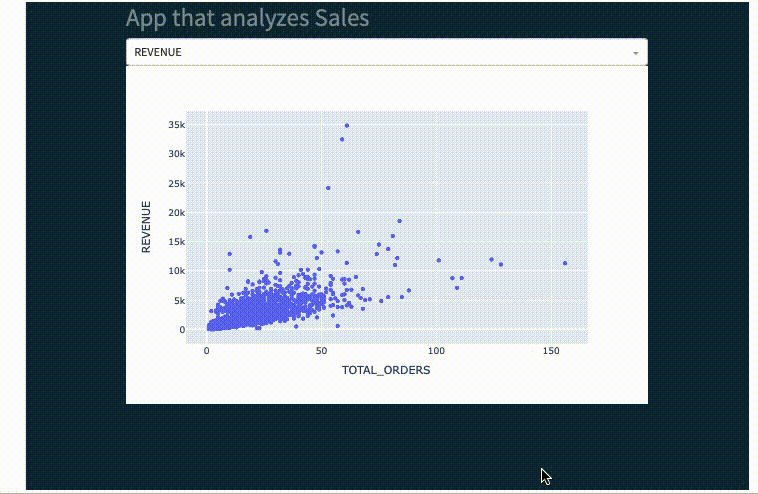
Next, we'll build a simple dashboard for analyzing and comparing attributes like REVENUE, AVERAGE_ORDER_VALUES, and CUSTOMER_ID against TOTAL_ORDERS.
Loading the dependencies
To start, load the following dependencies:
Next, create a JupyterDash object so that the web dashboard can be loaded in the Jupyter space:
Note that if you want to use Python files and load the dashboards on a web browser, you'll need to create a Python file with the name app.py and create only a Dash object instead of an additional JupyterDash object.
Once this has been completed, let's create the two different components that make up the dashboard app: the layout and callback.
Creating the app layout
Start by defining the layout of the app. We'll create a dashboard that takes different columns like REVENUE and AVERAGE_ORDER_VALUES as input, and outputs a scatter plot against TOTAL_ORDERS. We'll also select the input by choosing a dropdown component, and the output component will change depending on this choice:
In the above code, we define a Markdown component to mention the title of the app. We can use all the Markdown components like the title (#), bold letters (**), italic letters (*), etc. A graph component is then defined which creates a plot.
After creating the graph, create a dropdown component from which you can select different input fields like REVENUE and AVERAGE_ORDER_VALUES. You can also define the default value and various columns from the data set as part of this dropdown. Finally, create a container that organizes all the layout components to display in the app.
Creating app callbacks
Now that we've defined the layout components, let's use callbacks to provide interactivity:
In the above code, callbacks are defined with the keyword @app.callback and require input and output. Input components trigger callbacks when their value changes, while output components are used to update the layout based on the inputs.
The update_graph() function defines how to show the data. In the above code, a scatter plot is created using TOTAL_ORDERS and the values are selected from the dropdown component in sales_df.
Running the Dash app
Finally, run the app to access the dashboard using the following:
You should see an output like this:
Now that you have your simple admin dashboard ready for revenue data analysis, you can use different plots and graphs to create an app that best suits your use case.
Although you can create simple dashboards with Python and Plotly Dash, there are several limiting factors. Creating dashboards in this manner requires significant effort, lots of dependencies, manual code, and several components that can be challenging to manage.
If this method seems a bit too long and complex, then you can opt for an easier and more intuitive approach to building custom dashboards quickly.
An easier option using Airplane Views
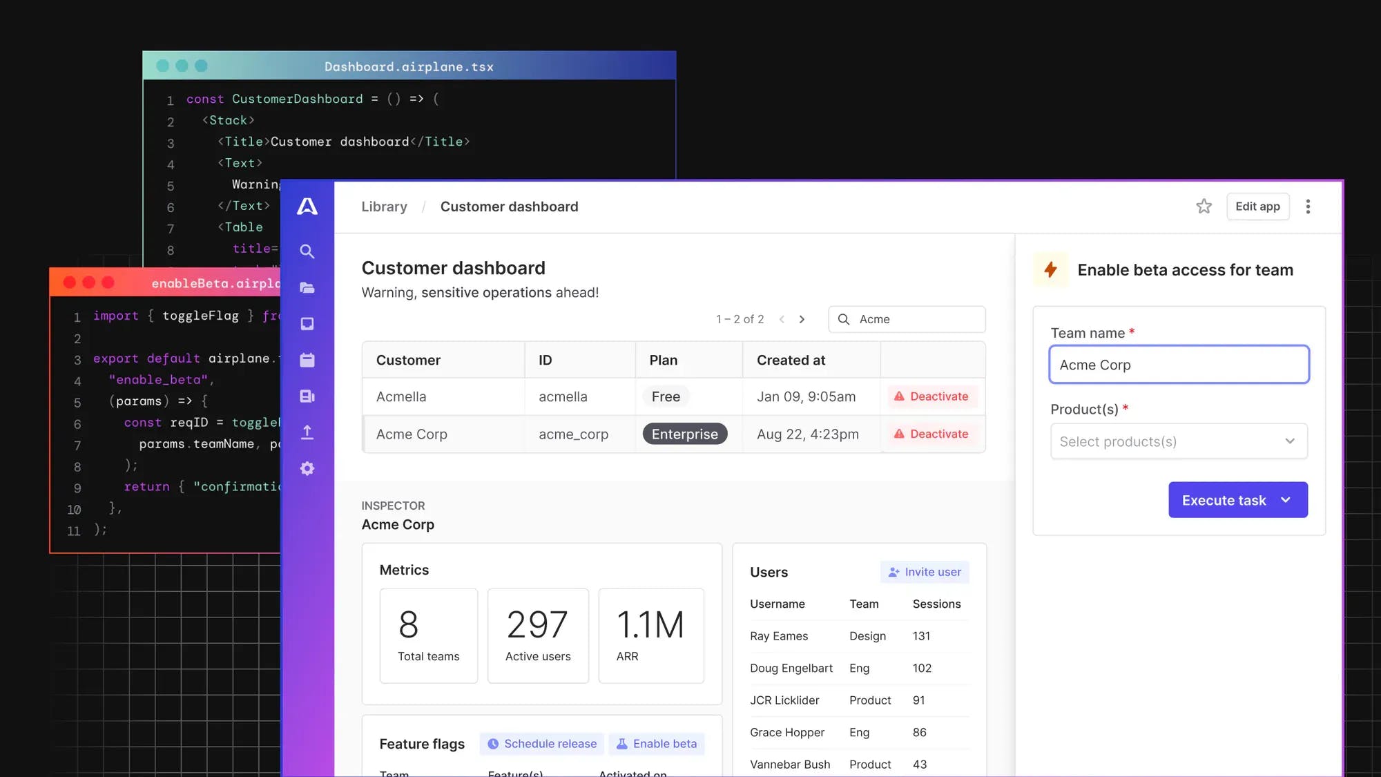
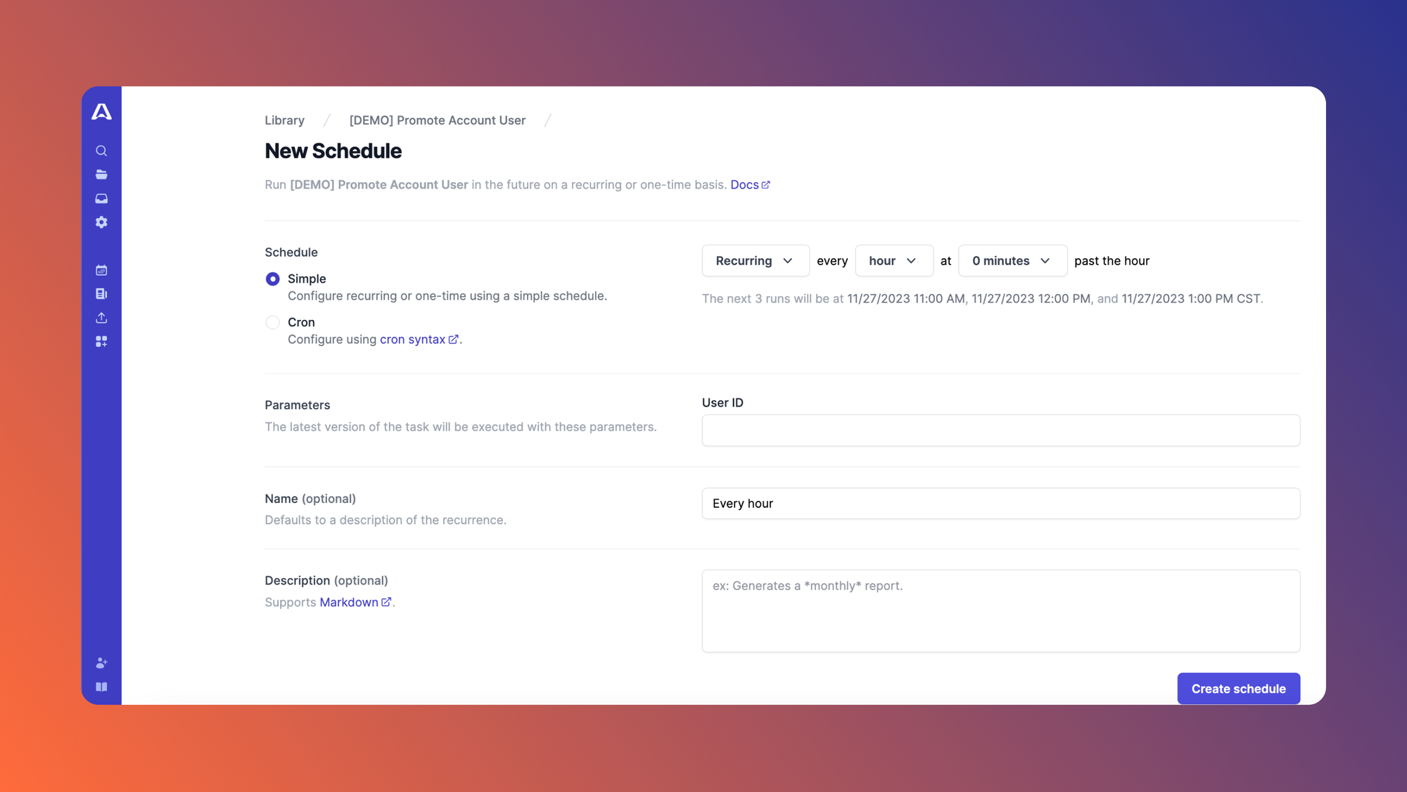
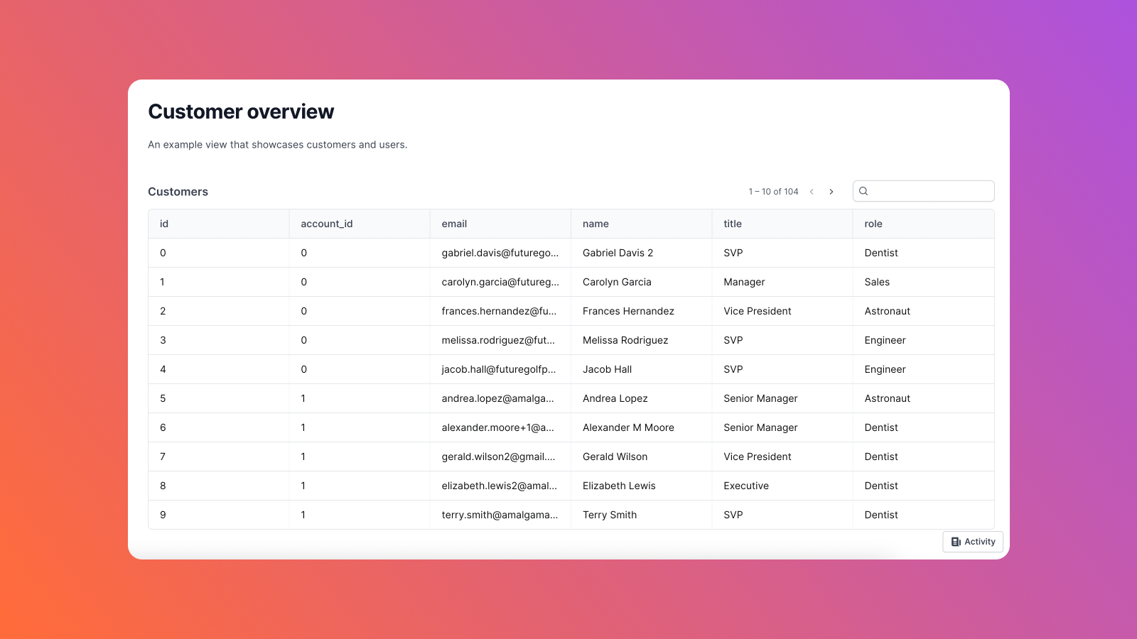
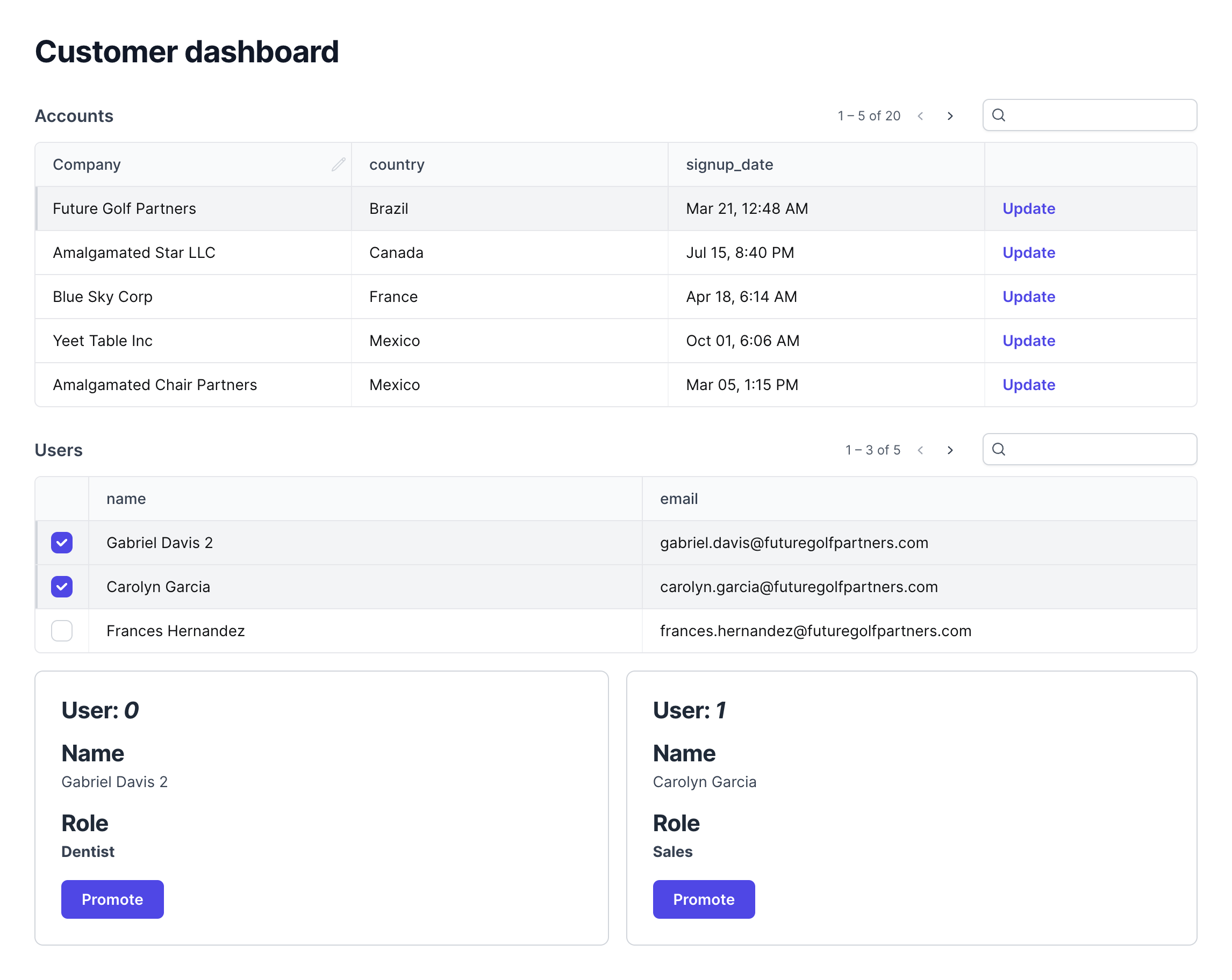
Airplane is an internal tooling platform that allows engineers to convert queries, APIs, and more into internal tasks, workflows, and dashboards. The platform offers Airplane Tasks, which are functions that anyone on your team can execute, and a feature called Airplane Views, which allows users to quickly build custom, internal dashboards such as admin panels, customer insights dashboards, and more.
There are several benefits to using Airplane Views to build internal dashboards. These include access to a rich, pre-built component library, an extensive library of templates, and robust guides and demos that make building internal UIs very quick and easy.
Let's now take a quick look at how we'd create the same admin dashboard in Airplane using the following, high-level steps:
- Create an Airplane account
- Download the Airplane CLI
- Install Node and nvm to create an Airplane View
- Open your terminal and navigate to the folder where you want to create the new view
- Run the following command:
airplane init --template=views_getting_startedto get started with the Airplane Views template - Run the command
Airplane deploy tasks --yesto deploy the relevant tasks, which serve as the backend to the view's frontend - Run the
airplane views devcommand to develop the view locally - Open the
customer_dashboard/customer_dashboard.view.tsxfile. This is the entry point to the view where your code mostly lives. - Customize the
customer_dashboard/customer_dashboard.view.tsxfile (such as editing specific columns and features) for the dashboard you want to create - Once you're done customizing your view, run the
airplane deploy .command to deploy it
To further understand in detail how to build an internal dashboard based on your custom requirements in less than 15 minutes, check out Airplane's documentation that provides a step-by-step guide.
That's all it takes to create a view on your own! If you're looking for strong defaults and robust documentation to help you build custom internal dashboards in just minutes, then Airplane Views is for you. Be sure to also check out the Airplane blog for additional content on admin dashboards, such as getting started with Active Admin, React JS tutorial, and building an admin dashboard using AdminLTE.
Conclusion
In this article, we discussed admin dashboards and walked through how to create a dashboard using Plotly Dash, a popular platform for building dashboards and analyzing data. We also covered an easier and more efficient way to build dashboards using Airplane Views. Airplane allows users to quickly and easily build custom, internal dashboards in under 15 minutes through strong default offerings.
Want to learn more about Airplane and how you can use it to build internal dashboards? Sign up for a free account today!
Author: Gourav Singh Bais
Gourav Singh Bais is a Data Scientist at Allianz and a technical author based in India. He is also skilled in developing machine learning/deep learning pipelines, transforming data science prototypes into production-grade solutions, and more.