
These days, no web-based system is complete without an administrative interface. The interface provides a focal point for privileged users to manage the entire system and perform CRUD operations (Create, Read, Update, Delete). While it's clear that having a fully functional admin interface increases a system's usability, creating something that scales and accounts for permissions, real-time updates, and fast access to information can be challenging.
Creating an intuitive and user-friendly interface is crucial for ensuring a positive admin user experience and decreasing the time it takes to complete admin operations. One common tool used by React and JavaScript developers is the react-admin library, provided by Marmelab. This tool enables you to create CRUD components with very few lines of code. In addition, you can use the MUI library to help customize your UIs.
In this article, we'll walk through how to build an admin panel using React JS. We'll show you how to create an admin interface, feed it data from an API, and then how to customize it.
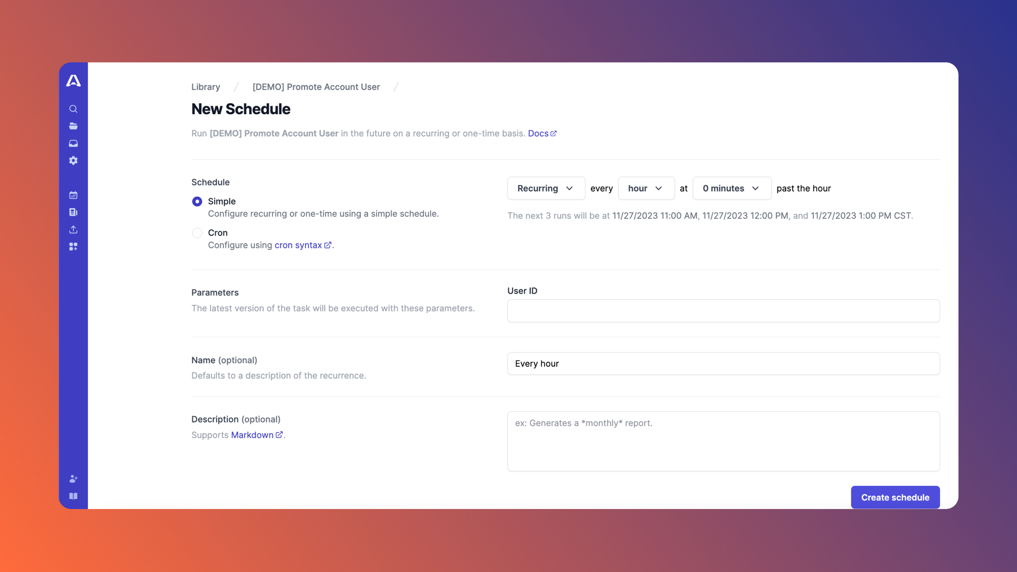
We'll also briefly introduce Airplane, a developer platform for quickly building powerful internal tools. Airplane has a feature called Views that's a React-based platform for building custom, full-featured UIs. Engineers use Airplane for developing admin panels, building customer onboarding workflows, creating feature flagging dashboards, executing support operations, scheduling long-running jobs, and more.
Prerequisites
We recommend the following prerequisites before beginning:
- Familiarity with JavaScript and the React library
- Node or Yarn installed on your machine. We'll include instructions below for building an admin panel using either tool.
Getting started
Let's create a new React app called admin-dashboard. We can do that by using the commands below:
- If you’re using NPM:
npx create-react-app admin-dashboard - If you’re using Yarn:
yarn create react-app admin-dashboard
Next, move into the auto-created folder with the command below:
cd admin-dashboard
The last step to getting started is installing the necessary dependencies. In addition to MUI and react-admin, we'll install two other dependencies. The react-admin data providers will use ra-data-json-server to communicate with the APIs based on the JSON Server backend. Then we'll use prop-types for type-checking.
If you’re using NPM, enter the following:
npm install react-admin ra-data-json-server prop-types @mui/system @emotion/react @emotion/styled
If you're using Yarn, use this instead:
yarn add react-admin ra-data-json-server prop-types @mui/system @emotion/react @emotion/styled
Now, let's start our app using npm start or yarn start.
Overview of react-admin UI elements
In almost every admin interface, admins will need to perform create, read, update, and delete (CRUD) actions. To achieve CRUD functionality, the library provides three element groups:
- Edition pages: Edition pages are elements used to create and edit data. They include
<Create>,<Edit>, and so on. - List pages: List pages are used to read data from the source. For example, they can list data retrieved from an API. Additionally, they come built with a delete button, which handles all delete functionality. Examples include
<Lists>,<ListGuesser>, and<DataGrid>. They come with paginations. - Show pages: When you click on an individual list item from a listing page, you're taken to the edit page. From here you can access a show page to show details of the row on its page. A show page contains an edit button that takes you to an editing page (if you created one). Show elements include
<Show>and<SimpleShowLayout>.
Ensure proper API configurations
To ensure the data retrieved from an API is usable, you must ensure that the API conforms to certain standards.
First, the APIs should have the CSRF policy disabled. Next, ensure that the X-Total-Count header is set to enable react-admin to calculate how many pages to render in its pagination functionality. The JSON Placeholder API is the API whose endpoints most adequately match these criteria. That’s what we'll use in this walkthrough.
Additionally, react-admin uses tools called data providers (dataProvider) to communicate with both REST and GraphQL APIs. This means that you don’t need a library like Axios unless you need to create a new data provider. You can use data providers to retrieve data from different API endpoints (and from different sources) to aggregate all data into one location: the admin dashboard.
Note that these data providers support APIs built on certain backends, listed here. If your backend isn’t listed, react-admin enables you to write your own Data Provider. This documentation provides a detailed explanation of the react-admin Data Providers.
Now it's time to start building our admin dashboard.
Build your admin panel
First, navigate to your src/App.js file and replace the existing code with this:
The code retrieves the user lists from the URL and displays them using a <ListGuesser> element. It features two elements: <Admin> and <Resource>. <Admin> is the container for the admin interface elements. It expects a <Resource> element.
One function of the <Resource> element is defining the CRUD routes and the components used for displaying resources in the admin application. A resource in react-admin is used for denoting entities retrieved from an API. A resource is defined by the name attribute for the <Resource> tag. It’s usually a slug in a URL. For example, name="users" will match the URL <baseUrl>/users.
Also, note the list attribute, which denotes a list component used to display your retrieved data. This is where you’ve integrated some intelligent guessing by using a ListGuesser element.
With just ten lines of code, your admin dashboard should look like this:
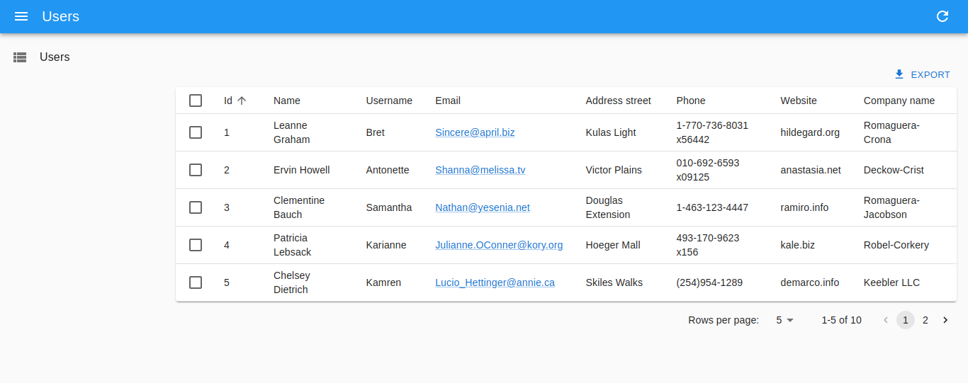
When you open your browser’s developer tools and check the console, you’ll see a structure rendered. This output from react-admin shows you the elements composing a row. You can use these elements to customize displays, such as the sequence, color, optional record omissions, label names, and more.
Customize your admin panel
Now, let's customize our panel. We’ll add two more <Resources> and assign icons to them. For the app bar, we’ll add a "theme toggle" button (<ToggleThemeButton>) that switches between light and dark modes when clicked.
One of the endpoints we'll add is a user post resource. We'll then create an edit page and show page for it.
Start by creating a folder called components in the src directory. Add a new file called PostEdit.js, then add the following code to the file:
This code contains a form and two text inputs. We set the form’s width to three-fifths of the page and added top padding of 5px. Each <TextInput> has a 5/5 width. You can also add other customizations to the elements, such as a custom color.
One important attribute is the source attribute of the text inputs. The source attribute is used to instruct react-admin on which column needs to be displayed in an element or where to map an element’s contents. In this case, if you add a value to the first text input and click the SAVE button, it will change the id of the record shown.
Next, we'll create a page showing a resource’s details. In the components directory, create a new file called PostShow.js and add this code to it:
In the snippet above, we used text fields to display data.
Instead of using the <ListGuesser>, you can create a component to display the lists. We’ll do this for the posts and user resources.
To begin, let's create two files named PostList.js and UserList.js in the components directory. In the PostList component, we’ll add custom labels to the columns. In the UserList component, we’ll reorder the rows so that the last four appear first.
PostList.js:
UserList.js:
The posts use foreign keys to match the users who posted them. You can learn more about how data providers manage such relationships here.
Modify the app bar component
The App Bar displays information and actions relating to the current screen. Now we'll add a ToggleThemeButton to our app bar. In the components folder, create a new file called CustomAppBar.js and add the following code:
This logic created a darkTheme property for setting the palette to dark. (Note: MUI marks the whole page as a palette.)
Next, looking at the toggle theme button, the lightTheme attribute is set as the default theme. The dark theme we created is set as the darkTheme attribute. You can also be creative and further customize both of these themes.
Now, we’ll finalize the changes by modifying the App.js file to match them. We’ll also add more resources with their respective icons. Replace the existing code with this:
We just created a new layout and passed in the properties (props) that'll be included. If we don't pass in these properties, the app bar will display without the resources.
Also, note the additional attributes, show, and edit, in the first <Resource> tag. These define the CRUD routes that we discussed previously in this article. Show maps to the show page and edit maps to the edit page.
In the code snippet above, we used the options tag to create labels. This is where you can pass in the options for an element. options.label allows to customize the display name of a given resource in the menu. Finally, we used the icon attribute to set an icon for each resource.
Your dashboard should now appear similar to the images below where you can toggle the theme from light to dark like we configured above.
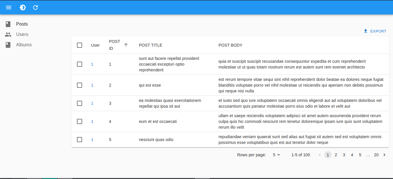
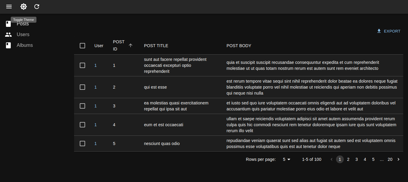
Clicking on a row in the Posts list should take us to the edit interface with text inputs.
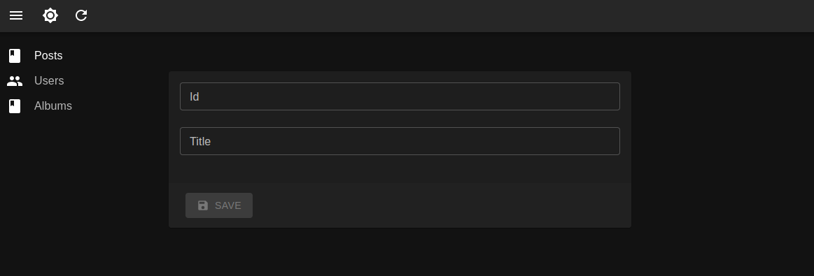
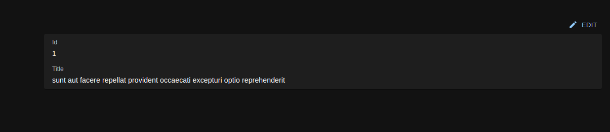
While on the Edit page, you can append /show to the endpoint to access the post’s show page.
Getting started
As we demonstrated in this tutorial, react-admin can help simplify the process of building an admin panel where privileged users can customize UIs and perform CRUD operations. Building an interface like the one above from scratch can be tricky without using the react-admin library. If you're a fan of React, there are other platforms that can help you create user-friendly and powerful custom interfaces like Airplane.
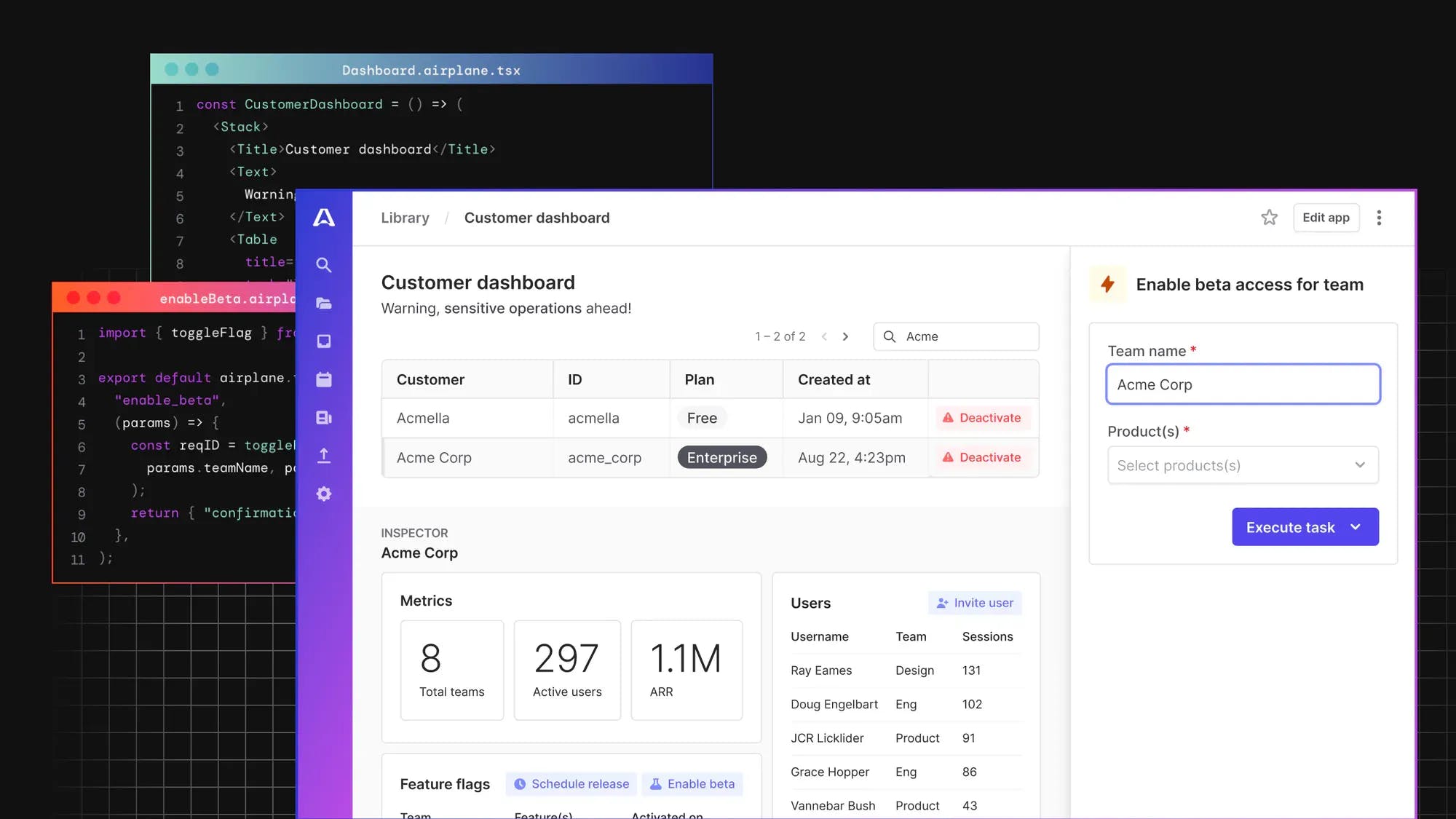
Using Airplane to build powerful React-based UIs
Airplane is a developer platform for quickly building custom UIs and workflows. You can use Airplane for operations like customer onboarding workflows, admin panels, feature flags, user management, support operations, and much more.
When it comes to building custom UIs, Airplane's Views feature supports a rich component library out of the box. You can use Views to build UIs and dashboards without worrying about maintaining design and other best practices. Airplane is constantly adding new components to its component library which is well-suited for internal use cases.
In addition to building custom interfaces, Airplane is a great solution for a whole suite of internal tooling needs. The platform layers on a web UI, notifications, input validation, role-based access controls, approval flows, audit logs, schedules, and more to develop applications that can be shared safely.
If you'd like to try it out, you can sign up for a free account or book a demo 👋.
Check out the Airplane blog for more content on dev tools-related topics such as how to make and schedule API calls in three steps, how to get started with Active Admin, a Django Admin crash course, and useful Python scripts for developers.
