


As your infrastructure starts to become more complex, you’ll need to consider adding many things. Different engineers will give you different answers about what's most important, but there's a good chance you'll hear monitoring mentioned as a practical first step. And soon after you start adding monitoring, you'll want to implement the continuation of monitoring: observability.
Observability expands on monitoring, in that it doesn't just look at the applications in your infrastructure and report classic metrics like CPU and memory. It provides deeper insight into your entire infrastructure, and it lets you see details like traces between applications — so you can see how different applications interact with one another. This can be incredibly useful, especially in architectures where a lot of services are running and interacting, such as a microservice architecture.
One of the best ways to get a high-level overview of how your applications are interacting is by implementing a service map. A service map is a visual representation of the services in your infrastructure, letting you see how they all work together — for instance, you can see a request go from the client to the frontend, on to the backend, and then the database.
Why do you need a service map?
Before answering the question of why you’d want to use a service map, it might be helpful to explain exactly what a service map is. As mentioned in the previous section, service maps are a visual representation of how your applications are interacting — such as showing how adding something to a cart involves multiple services in your infrastructure. Below is an example from Kibana showing how applications are communicating to complete a request from the client.
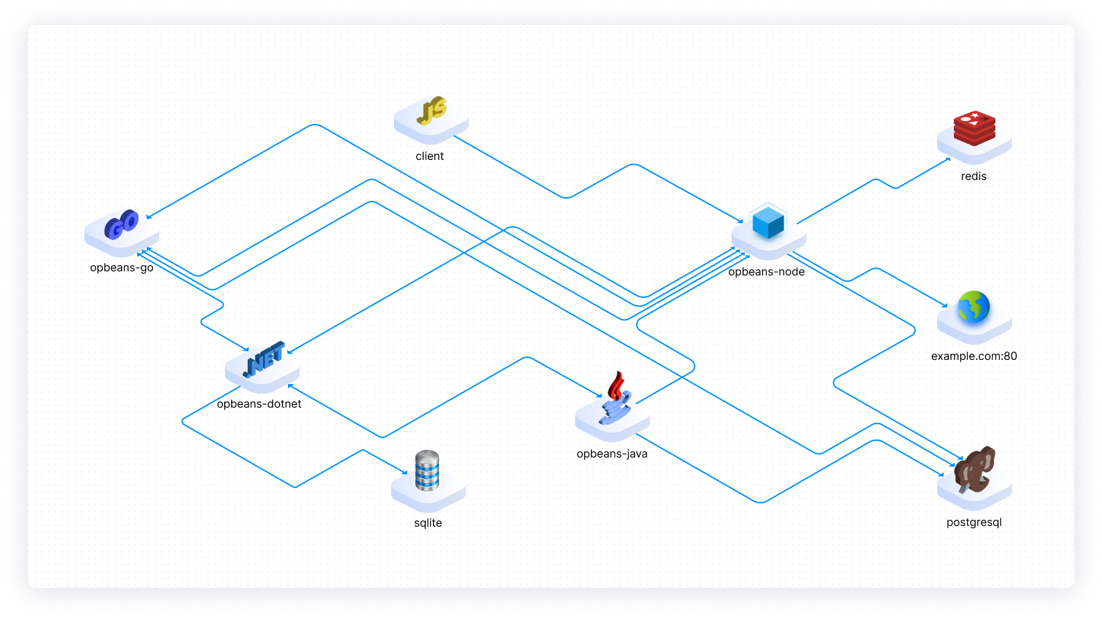
As you can see, a service map isn't incredibly complex — it can be as simple as icons representing your applications and lines connecting them. However, you can also be a bit more advanced with it and have it show different metrics, like latency. The most important function of a service map is to give you as the administrator an overview of the applications running inside your infrastructure. Note, however, that there’s a difference between what meets the basic requirements for a service map and what can be considered a good service map.
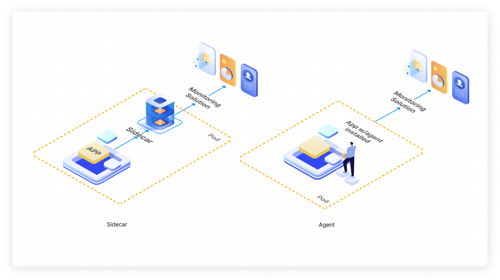
Initially, it may be difficult to see the value in setting up a service map — or rather, it can be tough to see when you’d actually use one. You've seen how service maps work, but the visualization of services doesn't happen magically. Service maps need to gather their data from somewhere. This is done either by instrumenting each application with an agent or sidecar that can pull data and send it to your monitoring solution, or by relying on data directly from the host — for example, how Pixie uses eBPF to get data directly from the Linux kernel.
No matter the approach, something needs to be added to your infrastructure in order to get a service map working. This might make it seem unattractive — some people might see a service map as merely the lazy version of an infrastructure diagram. And it's true that a service map can be used like an infrastructure diagram that's created automatically based on what your infrastructure is actually doing. However, it can also be much more than that.
The true value of a service map
It's only on the surface that a service map looks like an automatically created infrastructure diagram. Under the surface, you'll often find many useful features, like the ability to view the exact path of your requests. Perhaps the most important feature of a good service map, though, is that you can see metrics directly on the service map. These metrics are not only from the specific app that you're interested in, but also from the surrounding applications, which may lead to some unique insights, like figuring out why a request never reaches the application you're looking at.
Another great reason for using a service map is that services may not interact exactly the way you expect them to. While an infrastructure diagram is created by hand and shows the way that engineers and sysadmins expect things to relate, a service map is a continuously updated representation of how the infrastructure is behaving. This can reveal communication between services that you weren't expecting, or show that services that were supposed to communicate aren't communicating at all. Depending on the service map you use, you may even be able to see requests made outside of your own infrastructure, like calls to a third-party API. This depiction of your infrastructure's actual behavior provides deeper insight into whether applications are communicating with services they shouldn't be interacting with.
In addition, getting service maps set up is a great step toward getting more observability out of your monitoring. When you implement service maps, you're also implementing many of the features needed for great observability. One of the most important aspects is distributed tracing, which gives you detailed insights into how requests are moving around in your cluster. Increased observability can help you debug your infrastructure more easily, as you can clearly see direct correlations between a request and resource usage at the time an issue occured.
Service maps also allow you to see the exact point where a request is slow or results in an error. This is, of course, most useful in a microservice architecture. For example, you may have a request, sent from your frontend, that has become increasingly slow. This specific request may go through ten different services, and with traditional monitoring, it would be almost impossible to figure out where the slowdown is. With the observability that service maps offer, you can figure out exactly where in the chain of services there's an anomaly in execution speed.
Creating a service map
If you want to create a service map, you first need to instrument all the applications that should be included in the service map with a tool to collect the needed metrics. This instrumentation can be done directly in the code of your application, or if you're using Kubernetes, it can be done by setting up a sidecar. Using a sidecar, you won't have to change any code in your application. Instead, all the needed metrics will be picked up via the sidecar, usually by proxying requests through the sidecar.
Once you've instrumented your application, the tool needs to assign a unique ID and context to each request. This context will then be passed with the request to every service it hits. This is what's called a trace, and it’s the entire basis for creating a service map. With these traces, you can see the entire journey of a request from source to destination. The concept as a whole is called distributed tracing.
Implementing a service map with Istio and Kiali
Istio and Kiali will be used here to show you how you can create a service map in Kubernetes using open-source tools. It's not necessary to have an understanding of either of these tools; their main purpose here is to demonstrate how easy it can be to create a service map. Start out by installing Istio:
Now enter the downloaded directory by executing cd istio-1.13.4, replacing the version number if necessary. When you’re in this directory, make sure to add Istio to your path:
To get Istio running in your cluster, you should run:
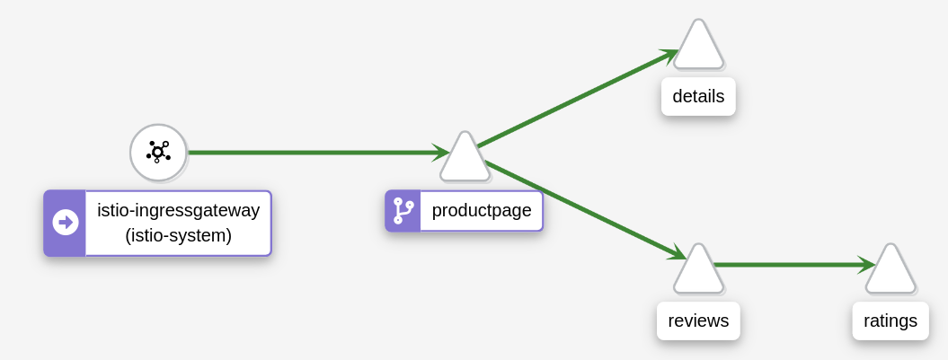
Now deploy the Bookinfo sample application that comes with Istio:
At this point, your application is instrumented with the Envoy sidecar proxy, and it's time to add the Kiali dashboard so you can view the service map. To do so, make sure you're still in the Istio directory you downloaded earlier, and then run kubectl apply -f samples/addons.
You're now ready to deploy the Kiali dashboard, which is where you'll view the service map. Make sure your terminal is still in the Istio directory, and execute kubectl apply -f samples/addons. This will deploy Kiali, as well as several other components that aren't relevant to this tutorial.
Once Kiali is installed, you can view the dashboard by running istioctl dashboard kiali. On the Graph tab, you can see the service map. Before you can see any traces, you need to send a request to the application:
Drawbacks of using service maps
Implementing a service map in your monitoring can aid you in many ways, but there are also some drawbacks you need to consider before you invest in a service map. First of all, you are going to be adding a lot of ingest data, as a service map requires a lot of information in order to create the visualization. It's possible to enable sampling so you don't get data from every single request, but each individual request will still carry a lot of data, so you need to be prepared for an increase in ingest volumes.
On top of that, it can take a while to understand a service map and use it effectively. You also need to remember that having a service map isn't, in and of itself, enough for good monitoring; you still need the remaining parts of observability, such as CPU and RAM usage, as well as proper visualization of these metrics.
Implementing a service map isn't going to require less effort than you've put into your traditional monitoring. There's a good chance that it'll require more effort to set up a service map than traditional monitoring. One of the biggest potential catches to remember about service maps is that they can quickly become confusing if you have a very large infrastructure. This complexity can result in getting less useful data from your service map than you might expect. A way to prevent this could be to divide your infrastructure into fewer parts, making sure the service map shows only what is relevant to a single application.
Final thoughts
As you can see, service maps can be incredibly useful in pretty much any infrastructure, but they’re especially useful in infrastructures where there are many different services. Service maps are a huge step in moving from regular monitoring to observability. This will help you get a more cohesive view of your infrastructure, and by extension allow you to more easily troubleshoot errors. It can also help you optimize your infrastructure, as it lets you more easily view the communication between your services.
If you're looking for a maintenance-free platform to build powerful internal tools, then check out Airplane. With Airplane, you can build custom workflows and UIs using SQL queries, Javascript functions, Python scripts, REST API calls, and more. You can use Airplane Views to quickly build a custom dashboard that helps you track your applications in real-time.
To build your first workflow or UI using Airplane in a matter of minutes, sign up for a free account or book a demo.