
React components are the core building blocks of React. Every project developed using React is made up of components. React component libraries provide shareable components that engineers can use across multiple React-based projects. Publishing a shared component library has several benefits: faster development of React projects, greater control over component design, easier ability to share across projects, and more.
In this tutorial, we will walk through how to build and publish a React component library so it can be used across multiple React projects.
Prerequisites
For this tutorial, ensure familiarity with the following:
- React and building React Apps
- npm
- Git
- GitHub
- TypeScript
Note that this tutorial uses Visual Studio Code (VS Code) and the Bash terminal. However, you may use any editor or terminal. Note that the editor and command-line arguments may vary from this demonstration if so. This guide will point out the use of Bash-specific commands so that you may use the equivalent commands for your specific terminal.
Setting up the project
To get started, let's initialize the project. Create a directory called my-library. From the command line, navigate to the directory in which you want to create the component library and enter the following Bash commands:
Next, open this directory in the code editor. Before proceeding, initialize the project with a package.json file. Back in the terminal, run the following command:
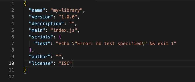
To make things simple, press Enter on the keyboard to accept the default suggestion for each question that follows. Once completed, the terminal will create a package.json file that looks like this:
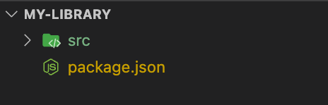
Next, create an src directory to house all of the library code:
The directory should look similar to this:
We are now ready to add to our library.
Building the first component
Before writing any code, let's install React as a dependency. In a regular React App, we would install React as a project dependency. When using this approach, we are telling the bundler to integrate React into the app code.
However, the library wants to avoid bundling React into its code. Instead, it wants to build only what is necessary for other React applications to be able to consume it. Therefore, we want to communicate that the library depends on React.
The first thing we need to do is install React as a dev dependency. At the time of writing, the latest version of React is 18.2.0. To install this, run the following command:
Running this command with the -D flag accomplishes two things. First, it updates package.json to include React as a dev dependency. Second, it creates package-lock.json. This lock file ensures the dependency tree will build consistently on any computer used.
Next, let's add React as a peer dependency, which tells the library consumer that it depends on a specific package but needs to be installed separately. As with our other dependencies, we can set it to the minimum necessary value according to semantic versioning.
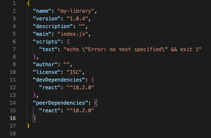
For the purposes of this tutorial, we'll set this value to the current version of React. However, in a real-world scenario, we would set it to the minimum version the code library needs to support. In the package.json file, add the following code below the devDependencies property:
The package.json file should now look like this:
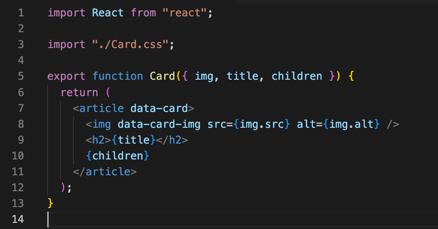
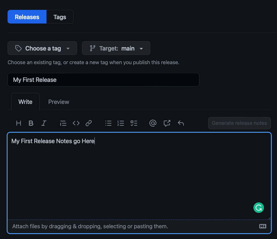
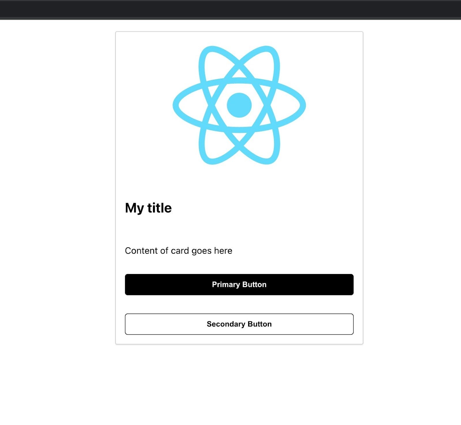
Next, we'll make a card component that will take in an image’s src, alt text, title, and children for the content.
To begin, create an index.jsx file in the src folder.
Next, add the following code to the newly created index.jsx file:
Now that we’ve completed the first component, we’re ready to add a build step.
Adding Vite to build the library code
For this tutorial, we’ll use Vite to build the library code.
First, install Vite as a dev dependency by running the following command in the terminal:
Next, create a build script in the package.json file that runs vite build. package.json should now contain the following code:
Vite is set up to build applications by default. We'll need to add a configuration file so it knows how to build in library mode.
First, ensure you are in the project’s root folder in the terminal. Then, add a file called vite.config.js. We can do this by running touch vite.config.js from the terminal or using the code editor’s file system explorer.
Next, open the vite.config.js file in the code editor and add the following:
In this file, we’ve given the build property a lib configuration, which tells Vite it’s building library code rather than application code. The defined configuration contains the entry file path, component library name, and output file name.
The file extension of the entry file path name is also essential. By setting the file extension to .jsx, Vite knows that it needs to perform the jsx transform on the file. If left as a regular .js file, it wouldn’t know how to parse the jsx in the file.
Vite is built on Rollup’s plugin API. In the vite.config.js file, we set React to be external in the rollup options, letting Vite know that React is intended to be external to the code output.
Now, we must create a build command so we can build the component code into something that can be run in the browser. In the package.json, let's add a build property under the scripts section. Add the following line above the test script:
Now, we are ready to run the first build. Execute the following command from the terminal:
This command creates a dist folder with two versions of the built file: an index.mjs file and an index.umd.js file. .MJS is the standard module form of the component, and .UMD provides a reliable universal backup for bundling into projects that don’t support JavaScript modules.
At this point, the library should be working, but it won’t be able to scale as we add more components. So, it’s time to do some refactoring.
Refactoring the card component
First, use the terminal to make a new folder, Card, in the src folder:
We need to create two files in this folder: Card.jsx and index.js.
Then, copy the code from src/index.jsx into Card.jsx by adding the following line to Card/index.js:
This enables us to export the contents of Card/Card.jsx from the Card/index.js file. Doing this allows us to import the contents directly from the Card folder instead of from Card/Card.jsx, which makes the import statement easier to read.
Finally, let's update src/index.jsx. Delete its content and replace it with the following line:
Now, everything should function correctly when we run the build script. We also have a better file structure for organizing this and future components.
Let's now style the card component using CSS.
Adding CSS to style the component
In the Card folder, add a Card.css file. Then, open the file in the editor and add the following code:
Next, import your CSS file into Card.jsx by adding the following line at the top of the file:
Then, add the appropriate selectors to the card elements. This is how the final Card.jsx file should look:
If we now run our build script, we’ll notice a new file in the dist folder: a style.css file with the card’s styles minimized.
With the reorganized folder structure and CSS for the components, it’s time to add another component.
Adding another component
Let's build a Button component following the same pattern as the Card component.
In the project’s root folder, create a new folder called Button and add three files: Button.jsx, Button.css, and index.js. Paste the contents of this tutorial’s Button/Button.css file into the CSS file:
Then, add the following code to Button.jsx:
In the above code, we assign the value primary to a prop called kind, then pass this value to the data attribute for styling. The rest of the props are passed to the button, allowing it to work like any other native HTML button. We also used React’s forwardRef utility function so that the ref, if used, will be appropriately forwarded to the button element.
Finally, update the Button/index.js file and the src/index.js by adding the following to both files:
Run the build script. We will now see that both the component and its styles are built into the dist folder.
Let's now add one more thing to make this component library useful: TypeScript.
Adding TypeScript
To bring TypeScript into the project, install it as a dev dependency from the terminal:
Once complete, initialize the project for TypeScript by running the following command:
This action creates a default tsconfig.json file that the TypeScript compiler will use to warn us of type errors.
Then, add a few more properties to tsconfig.json. Update the /tsconfig.json file with the following code:
Next, modify the project so that TypeScript can help build the React components. Start by changing all the .jsx file extensions to .tsx and all the .js extensions to .ts. Remember to update the entry file in the vite.config.js file.
Install the types for React by running the following command:
Update the components to be type-safe. Start with the Card.tsx file:
Then, update the Button.tsx file:
We can now successfully run the build script, but notice that the dist folder doesn’t have any TypeScript declaration files. This is because Vite can strip away the types but is unable to emit the library’s declaration files. To resolve this, add the following step to the build script:
Now, running the build script creates declaration files for the library consumers. To make them consumable from anywhere, let's host them on GitHub.
Preparing to publish to GitHub
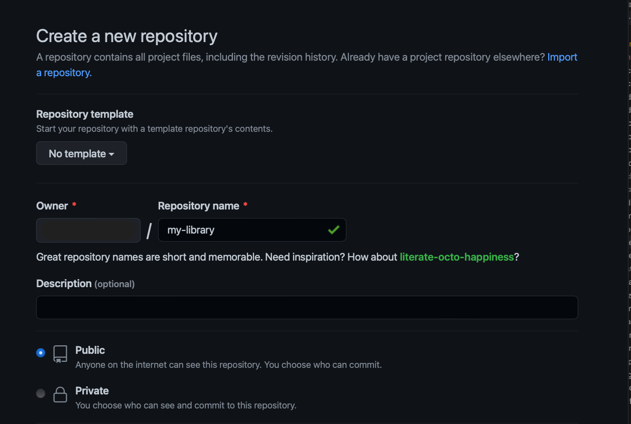
First, visit GitHub and create a new repository called “my-library”.
Once we have our empty repo, run the following command from the terminal:
Now, add a .gitignore file to avoid pushing unnecessary files to GitHub:
There are numerous useful .gitignore templates, but for this tutorial, we'll use the minimum necessary:
Next, stage the changes and make an initial commit:
We can now run the following commands to connect the local project to the GitHub repository. Remember to replace YOUR_NAME with the GitHub username:
We should now have a copy of the code on GitHub, so we will set GitHub up for publishing packages.
First, prepare package.json to publish to GitHub. Change the name property to @YOUR_NAME/my-library. For example, if your username is pink-kiwi, the package name should be @pink-kiwi/my-library.
Then, update the test script to exit 0 instead of exit 1. exit 0 means that it won’t display an error message when running the published scripts on GitHub.
Now, update the main property to point to dist/index.umd.js. We need to also add a module property, a types property, and a files property. The module property and types property must point to the correct files in the dist folder. The files property takes an array of files and directories that the consumer requires of the packages. It also ensures that only the files necessary are published.
Then, add the publishConfig property, which GitHub needs in order to publish the library. publishConfig needs to have the following value:
Replace YOUR_NAME with the GitHub username. The package.json file should now look like this:
Next, add a .npmrc file to the root of the project with the following value:
Then create a GitHub Action YAML file. At the root of the project, create a .github folder and create another folder inside it called workflows. In workflows, create a file called release-package.yml and add the following code to it:
Stage all these changes, commit them, and push them up to GitHub using the following code:
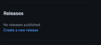
Now, let's publish the package by creating a release.
Publishing a release
On the Repo's homepage, navigate to the righthand side to create a release:
Click on the Create a new release link. Give the release a title and description:
Then choose a tag. It’s best to choose one that is the same release number as the package:
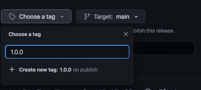
Once we have the tag, title, and description, submit the release. This will take us to the confirmation screen:
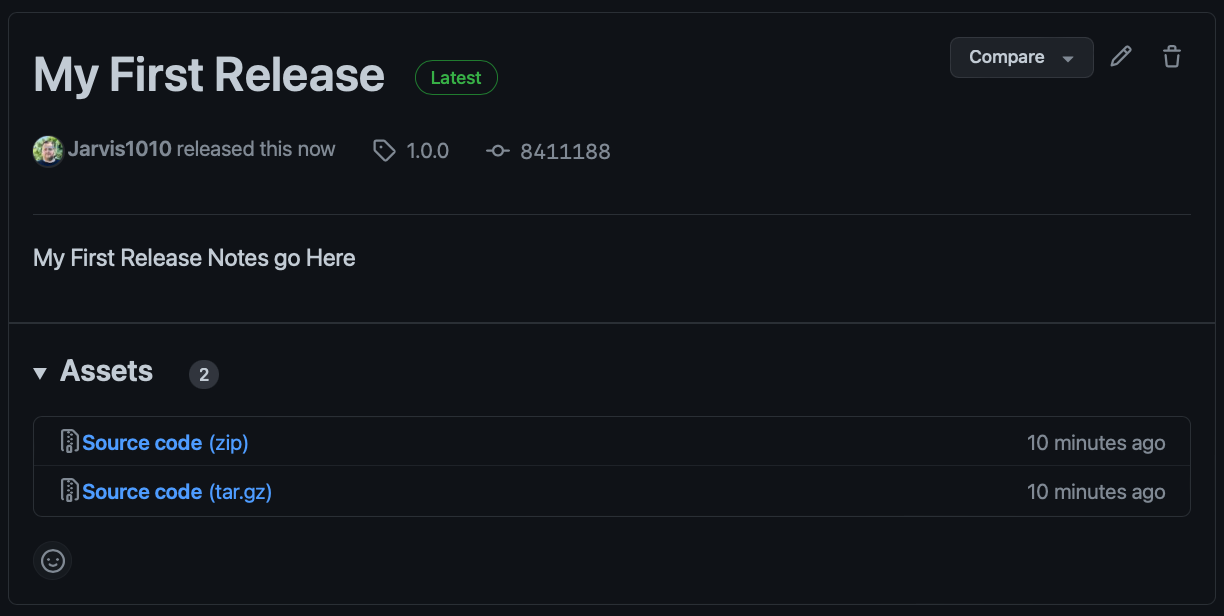
This release will automatically trigger a GitHub action that will publish the package. We should then see the published package on the repo's homepage:
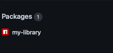
And we have now successfully published our component library.
Using the component library
Now, let's put our component library into action. In a new folder, create a new React project using the code below:
Then bring up the directory into the code editor. Before installing the library, copy the same .npmrc file from the library project into this project. To install the package, we must create a personal access token with read:packages access. GitHub has more information on creating a personal access token.
Once we have the personal access token, go to the .npmrc file and add the following line to the top of the file:
Replace {PERSONAL_ACCESS_TOKEN} with the GitHub token. Now, install the component library using npm:
We're now able to use the component library in the app.
Next, change the App.js code to match the following:
Then, update the App.css file as follows:
Run the start script. The output should look something like this:
And that's how to create, publish and use a React component library from scratch! Building a React component library is a good way for engineers to share components across projects, making project development easier and quicker. Although building a library from scratch has several benefits in the long term, it can be challenging to build upfront. Building a library requires significant resources and cross-functional commitments involving engineers, designers, and product teams. Maintaining a React component library can also be very costly and time-intensive as well.
Luckily, there is an easier way to access and use React component libraries.
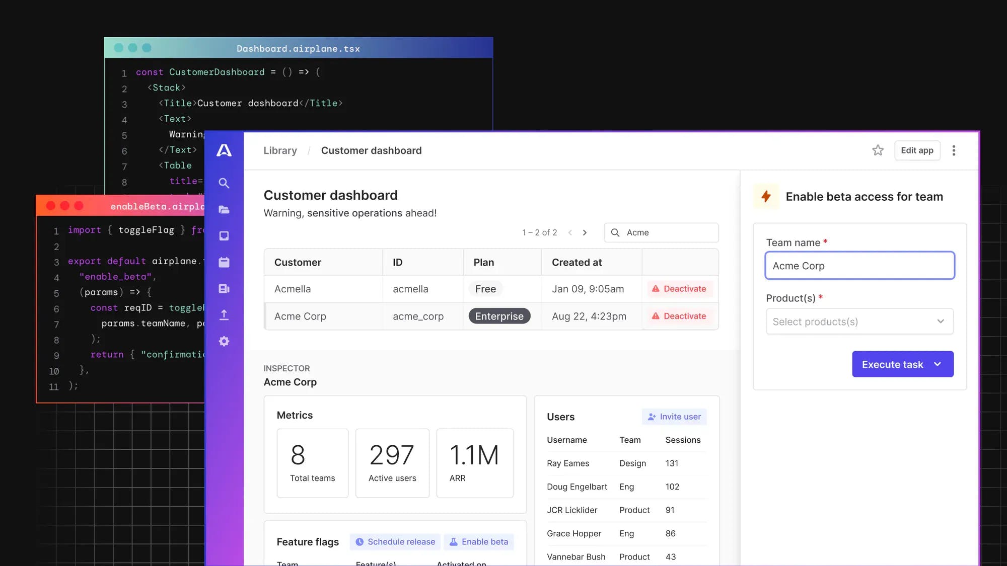
Introducing Airplane
Airplane allows users to build powerful tasks and UIs using scripts, queries, APIs, and more. The basic building blocks of Airplane are tasks, which are single or multi-step functions that anyone on your team can execute. Airplane Views is a React-based platform that makes it easy for engineers to build complex UIs within minutes. Airplane offers a rich React-based, pre-built component library, making it fast and easy for developers to build complex, and custom UIs. In addition to the pre-built component library, Airplane also offers users the ability to create custom components in a fast and secure manner. Engineers can build their own custom components within minutes using Airplane.
To learn more about React components, check out our blog for content such as how to force React components to re-render, React JS tutorial, and more.
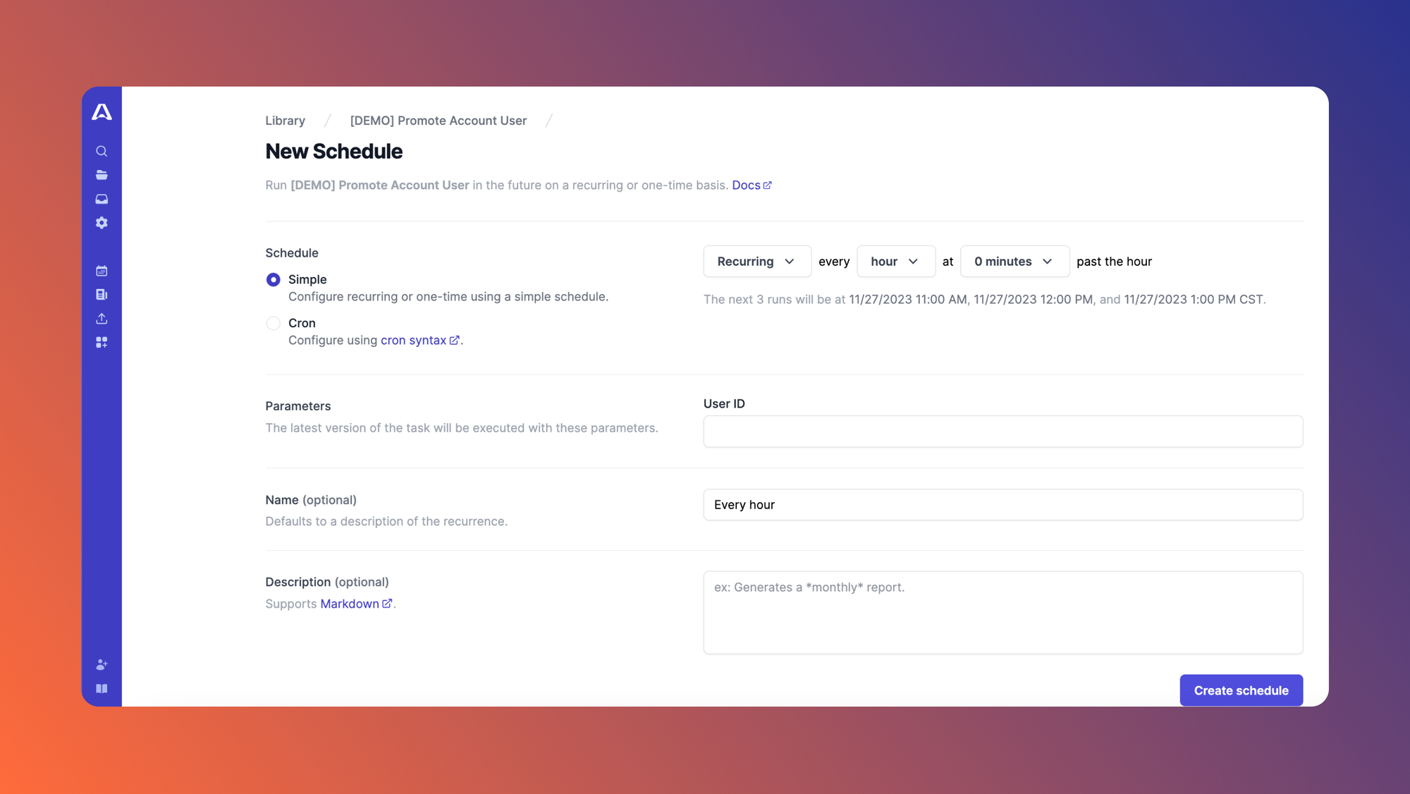
Airplane also provides robust built-ins, such as audit logs, job scheduling (which replaces cron), permissions setting, and more.
To try out Airplane and build your first UI using React components in minutes, sign up for a free account or book a demo 👋. If you are at a startup that is series A or earlier with under 100 employees, check out our Airplane Startup Program for $10,000 in Airplane credits for a year.
