


React CSS Modules are a technology used in React applications to allow for modular and scoped CSS styling. With this approach, developers can create CSS styles that prevent naming conflicts and ensure that styles are encapsulated within specific components. This allows for greater control over styles and makes them easier to maintain and update.
When building React applications, React CSS Modules provide a simple solution for managing styles, allowing developers to use separate CSS files for each component with unique class names that are scoped exclusively to that component.
In this article, we'll discuss React CSS Modules and how to use them to manage the styles in an application in a modular and effective manner.
Why you need React CSS Modules
In a React CSS Module, a CSS file is imported as a JavaScript object into the React component. The class names in the CSS file get changed to unique class names at build time and are then appended to the HTML when the component gets rendered. As a result, no other CSS in the application can modify the styles for any individual component because they're entirely independent.
React CSS Modules are specifically helpful for building dynamic user interfaces, styling individual components, and creating reusable styles. For example, if you have a React application that uses a button component in several instances with various stylings, each instance of the button component can have its styles set and maintained using React CSS Modules. This guarantees that each button appears and functions as intended.
In addition, the styles can be applied to several application components, minimizing the amount of duplicate code and simplifying style maintenance as the application grows. Because of this, React CSS Modules are helpful when creating dynamic user interfaces that need to manage styles in a way that is flexible and scalable.
Ultimately, React CSS Modules improve app performance by minimizing the amount of CSS that needs to be loaded and parsed by the browser. In addition, by decreasing the likelihood of naming conflicts and making it easier to change styles, CSS Modules contribute to increased maintainability. Styles can be changed or removed by developers without impacting other areas of the application.
How to style React apps with CSS
Designing engaging and user-friendly interfaces for React apps requires careful consideration of CSS styling. The next sections discuss a few of the most widely used methods for styling React applications with CSS.
Using inline styling
Inline styles are applied directly to the respective elements by utilizing the style attribute and the styles object. If only a few styles need to be applied to a specific element, the style attribute can be helpful:
This code is a functional React component that returns a single <div> element, two header elements, and a paragraph with inline styling. Since what gets rendered is written in JSX, pure JavaScript statements need to be enclosed in curly brackets to be used. We inject JavaScript into JSX in the first set of curly brackets. Then, in the inner brackets, the elements receive the styles in the form of object literals.
Because the properties are objects, we need to separate them with commas. In addition, the attributes are expressed in CamelCase and are not separated by a dash because they're JavaScript attributes.
Using a CSS file
An alternative method often employed for styling in React involves utilizing external CSS files.
The typical approach is to make a distinct CSS file that styles each component and import that file into the component file. This is helpful if we have a collection of designs that we want to apply to various components, such as:
This CSS file has three class selectors that can be used to apply the appropriate styles to elements: .container, .red-header, and .gray-header.
In order to use these classes in JSX, we need to import the stylesheet file into the component file before including a className attribute for each JSX component:
Utilizing styled-components
The styled-components library utilizes tagged template literals and the power of CSS to enable us to create actual CSS code to style the components. In addition, we don't need to map between components and styles, making it easy to use components as a basic styling framework. That means we can include real CSS in the JavaScript code using styled-components:
The code above creates styled components (Container, RedHeader, and GrayHeader) that can be used to replace typical HTML tags with specified component style tags. A styled component is used like any other standard HTML element. The only distinction is that it has its own set of preset styles. This means we can design reusable, independent components that are simple to handle and test.
Designing using SCSS
The popular method of styling React apps with Syntactically Awesome Stylesheets (Sass) combines the strength of the CSS preprocessor with the adaptability and modularity of React to create user interfaces. SCSS is a syntax for Sass that can increase the efficiency and maintainability of styling in React projects by adding features like variables, nesting, and mixins to the capabilities of normal CSS.
In order to be utilized, SCSS must be installed in the project. We can use npm or Yarn to do so.
To install it with npm, execute the following command in the project directory:
To install it with Yarn, use the following:
Next, create a SCSS file for the styles (.scss is the standard extension for SCSS files):
Here, the variables primaryColor and secondaryColor are created to hold the values for the colors. The variables get used in the .redHeader and .grayHeader classes respectively. We can also see that the classes .redHeader and .grayHeader were nested into .container:
Import the SCSS file and apply the styles as standard CSS classes in the JSX code to use Sass in the React components.
Utilizing CSS Modules
CSS Modules enable us to use the same class name without conflicting in multiple files since each class name is assigned a distinct programmatic name. For large projects, React CSS Modules offer several advantages, including modularity, reusability, maintainability, scalability, and increased teamwork.
React CSS Modules can help large apps attain a more organized, maintainable, and scalable codebase, improving development efficiency and user experience. They do this by providing a standardized way of handling styles. With this method, every class name has a local scope that only includes the component for which it's being imported.
CSS Modules, in their most basic form, operate by creating distinct class names for each component at build time and adding those names to the HTML when the component is displayed. The only difference between a standard stylesheet and a CSS Module stylesheet is the extension, which is typically .module.css:
Please note: CamelCase naming is advised but not required for local class identifiers.
After writing the CSS styles, import the file and then refer to the specific style from the imported styles to use it in a React component:
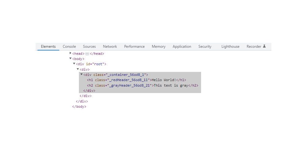
Here, we refer to the classes .container, .redHeader, and .grayHeader from the imported styles, and the appropriate styles get implemented on the elements. We can implement the necessary designs by referencing each class in the stylesheet using the styles object. Additionally, a close examination of the page reveals that distinctive, generated names are added to the CSS classes:
And that's how to use and manage React CSS Modules.
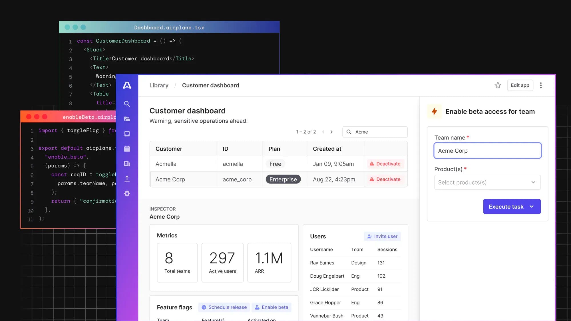
Introducing Airplane Views: A React-based platform for building custom UIs
Airplane is the developer platform for building internal tools. You can use Airplane to transform scripts, queries, APIs, and more into powerful workflows and UIs. Airplane Views is a React-based platform that makes it easy for users to build custom UIs quickly.
Airplane offers out-of-the-box components and templates that make it easy to get started. You can also build custom components and connect to third-party libraries.
Airplane also provides enterprise-grade features, such as approval flows, audit logs, and notifications, that help you create secure workflows that can be easily shared among your team.
To build your first React-based View in minutes, sign up for a free account or book a demo.
