

When you’re building a web application, icons are a great way to communicate important information without having to resort to putting more text inside your user interface. And if you’re building your UI with React, there are many libraries that can be quickly integrated into your application to give you access to hundreds of icons out of the box.
In this article, we’ll take a look at a few of these libraries, the similarities and differences between them and how you can integrate them into your next React project.
Popular icon libraries
While there are many different icon libraries out there (and you can always include your own custom icons using SVG), the following are some of the most popular.
Heroicons
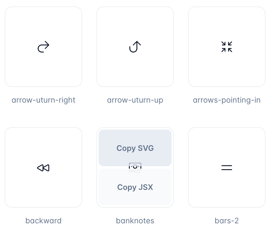
Originally developed by the creators of Tailwind CSS, Heroicons is a collection of 292 icons with libraries for both React and Vue. In addition, all of the icons are available as a Figma file so designers can use these icons as well, making it even easier to go from a finished design to a fully-developed UI.
The icons in this library come in three styles: outline, solid and mini, making them useful in a variety of contexts and applications. Any of the three styles can be implemented into your application either by inserting the SVG code for the icon directly or by using the provided React library.
Font Awesome
Font Awesome is one of the original icon libraries, originally designed to be used with Twitter Bootstrap and released in 2012. While it was a free library for much of its existence, there is now both a free and paid version of Font Awesome. Paying for Font Awesome Pro gives you access to more icons, additional styles (weights) of all the icons, quicker updates as new icons are released and more.
The documentation for Font Awesome is extensive, with pages for every icon. And just like Heroicons, icons can be included directly via a copy/paste of SVG code or by using the Font Awesome React library.
Material UI
By far the most extensive single icon library in this list, Material UI’s 2,100+ icons are great to reach for, especially if you need icons that are not part of the other icon sets. Material UI provides Figma, Adobe XD and Sketch files for designers to use as well as a convenient SvgIcon component that can be included directly in React applications.
Unlike some of the other icon libraries we’ve discussed here, the Material icons aren’t as easy to embed directly via SVG, however a tighter integration with React makes them easy to use in React projects, especially if you’re already using other components of Material UI.
Styled Icons
If you’re interested in some of the icon libraries above (or even one that wasn’t on our list) but want to use icons from multiple different libraries in your project, you should check out Styled Icons. With Styled Icons, you can mix and match icons from 20 different icon libraries. While each icon still has to be imported individually before it can be used, Styled Icons saves you time by not forcing you to import multiple libraries into your next project, while still giving you access to 20,000+ icons.
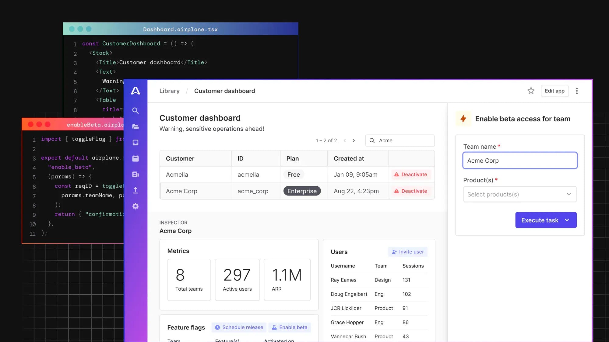
Airplane Icons
If the React application you’re building is a frontend for an internal tool, consider Airplane. With Airplane, you can quickly build full-featured UIs with React by using the component library built-in to Airplane Views. One piece of this component library is the Icon component, which allows you to quickly implement Heroicons inside your application with no additional work required. You don’t have to worry about build tools, importing another npm package, or anything else.
Because the Icon component uses Heroicons under the hood, you also get access to all 3 Heroicons styles (solid, outline and mini).
Implementing an icon library in React
Once you’ve chosen an icon library to use with your React project, you need to decide on the implementation. Depending on how many icons you’re going to need, you may decide to use your chosen icon library differently.
Including directly via copy/paste
If you’re only going to be using a couple icons in your application, you might not need to include an entire icon library to achieve the results you’re looking for. As an example, Heroicons allows you to copy the SVG code for any icon directly from their website.
Once you have the SVG code copied, you can insert it anywhere into your React app or import it as a component.
This is the easiest way to get started using icons, especially if you’re only going to be using one or two. If you’re using more than just a few icons or want to make customizations to your icons like you might with other React components, you might want to use the official React library for your chosen icon set.
Installing the React library and rendering icons
Sticking with our Heroicons example, let’s look at how we might install that as a library to make it easier to integrate Heroicons into your React application.
First, we need to install the npm package: npm install @heroicons/react. With that installed, you can now import individual icons into your other React components. For example, including the beaker icon like this:
A full list of the different available icon components can be found on UNPKG.
Customizing rendered icons
Because Heroicons were created by the creators of Tailwind CSS, it’s easy to customize Heroicons with Tailwind classes once you’ve imported them. You can find a full list of the customizations Tailwind enables in their documentation.
If we wanted to customize our BeakerIcon component by adding some Tailwind classes, that might look something like this:
If, instead of using Tailwind classes to customize our icon, we wanted to pull one of the different icon styles that Heroicons provides, we can do that as well, by changing the import statement to import the different style.
Integrating icons in your UI with Airplane
If you’re looking for an even easier way to build React applications, especially if you’re building an interface for your internal tools, you should take a look at Airplane. Airplane’s Views consist of different reusable components that you can use to customize and design the layout of your application. Since Views are built using React, you can also implement your own React custom components and easily import any external library from the React ecosystem (including icon libraries).
If you're interested in trying out Airplane, you can sign up for a free account to get started or say hi at [email protected]!
