

Drag-and-drop functionality is an important component of modern UX design. Users may use this functionality for things like reordering items in a list, moving objects in a graphics editor, drag-and-drop file loading, or grouping different elements together. Drag-and-drop functionality is built into HTML in the form of the Drag and Drop API, but the API is notoriously quirky and difficult to work with, so many have developed libraries to help handle dragging and dropping without making the developer interact with the HTML Drag and Drop API directly.
In this article, we'll introduce a draggable component library called React Draggable, and discuss how to use these React Draggable components.
What is React Draggable?
There are several different libraries that help create "draggable" React components. One of them is react-draggable.
React Draggable is a simple, customizable library that creates draggable components that manage their own state. It works by wrapping the React component in a <Draggable> component. Users can control various behaviors using certain predefined props. For example, users can set the axis prop to allow for movement only on the x or the y axis or set the bounds prop to force the draggable component to stay within a certain area.
The react-draggable library is useful when users want to quickly implement a draggable UI element in React but do not want to interact with the HTML Drag and Drop API. While React Draggable isn't as flexible as React DnD, it's easy to understand and use for simpler use cases.
Implementing a draggable list app using React Draggable
In this article, we'll walk through how to make a list app with draggable notecards using React Draggable. You can view the GitHub repo for this project to follow along.
Creating the app and installing React Draggable
Let's start by creating the app and installing React Draggable. In this example, we will be using Create React App. To create the app using Create React App, type the following in the console:
This creates a React app called draggable-list, then changes directories into that folder.
Next, install React Draggable using npm, and start the server:
Creating the components and connecting them
In the src folder, create another folder called components. In the components folder, create two files: Card.jsx and List.jsx. <Card> components will be draggable "index cards" with a header that can be edited and a text box where notes can be written. The <List> component will serve as a container for the <Card> components. For now, add placeholder code to each file.
In Card.jsx, type the following:
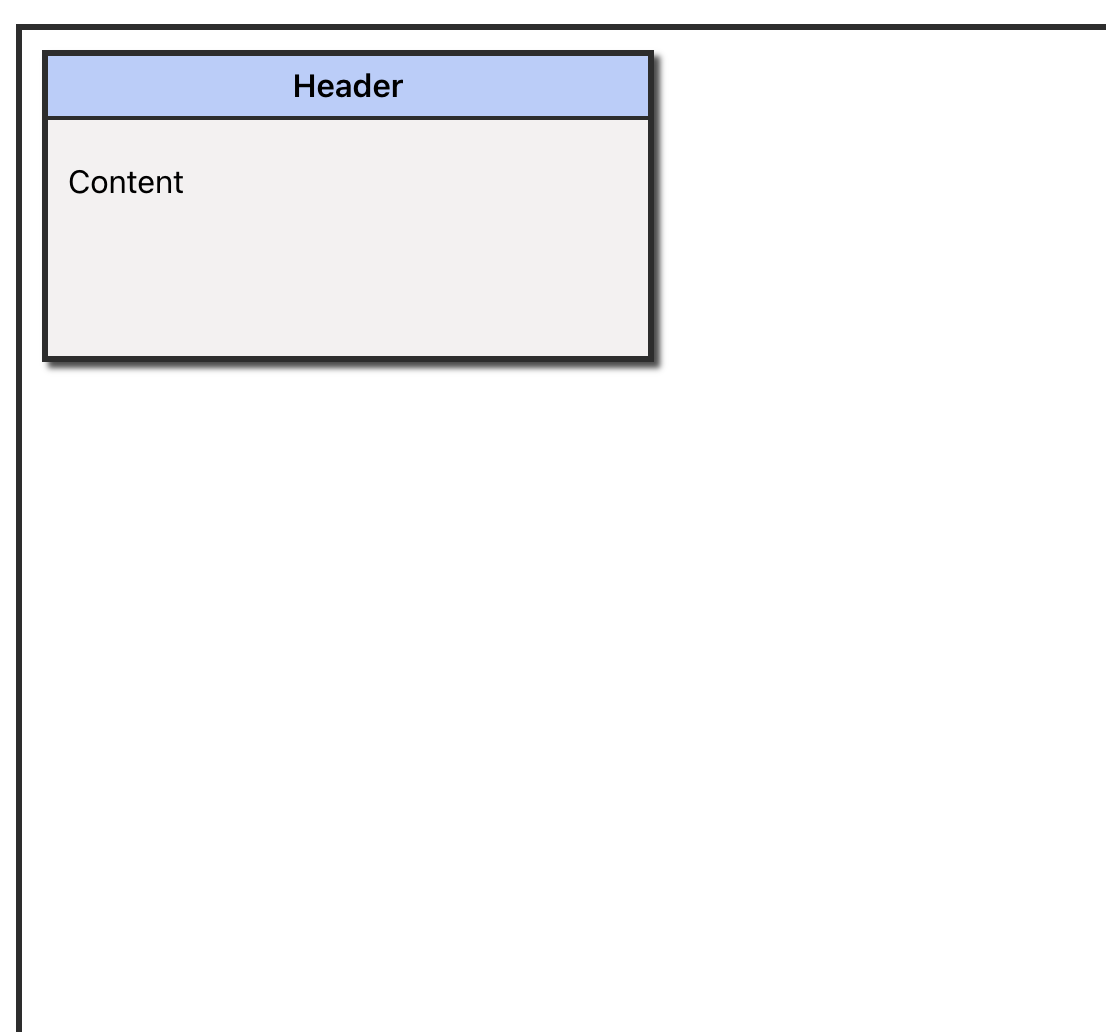
This creates a simple <Card> component with a header area and an area for written content. For now, enter placeholder text in those <div>s.
Next, in List.jsx, type the following:
Here, we are importing the new <Card> component and returning a <div> with a single <Card>. We will be adding more cards later, but for now, we want to make sure everything is importing and rendering correctly.
Finally, remove the section of code in the App.js file that's inside the outermost <div> and replace it with one <List> component. Don't forget to import the <List> component from the components folder:
Adding some styles
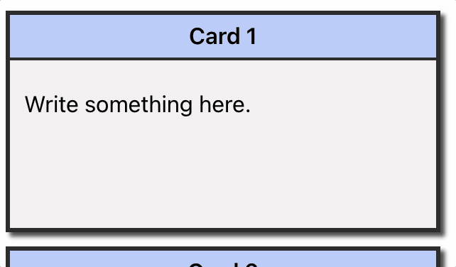
We can add some CSS styles to make it easier to see the components. Delete the contents of App.css, then add styles for the list, card, header, and content classes. Use the following styles:
If we use the above styles, the app will look something like this:
Displaying cards in the list
Now, we'll use React's useState hook to create a state variable to store some cards.
First, import the useState hook from React, then use a destructured array to create a state variable. For now, we'll be creating cards using dummy data for the card titles. Eventually, we'll create functionality to add new cards with custom titles.
In List.jsx, add the following before the return statement:
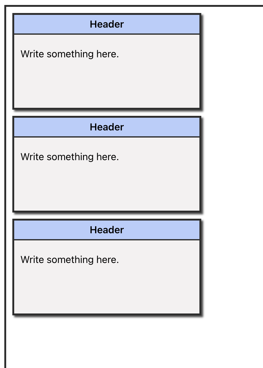
This creates the variable cards that stores the current state and a function setCards that updates that state and initializes it to a short array of dummy card objects.
Then, in place of the single <Card> component, use the map method to map the elements of the cards array to <Card> components, as follows:
This creates a <Card> component for every object in the cards array, passing the object's title and id as props to that <Card> component.
After implementing this, we can check the app in the browser, and it should look something like this:
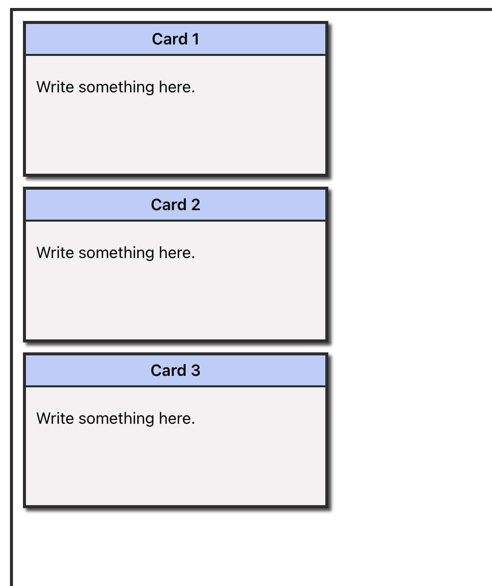
Notice that although we passed card.title to the <Card> components as a prop, this is not reflected in the cards themselves. This is because the contents of Card.jsx are still hard-coded.
To display the cards' titles, change Card.jsx to the following:
Don't forget to pass the props parameter to the <Card> component.
Now, the header should display the title prop:
Before working on the content portion of the <Card> component, we can make the cards draggable.
Making the cards draggable
Although the cards are created, they're not draggable by default. Adding this function is very straightforward using react-draggable.
In Card.jsx, first import the <Draggable> component as we see here:
Then, wrap the outermost <div> in a <Draggable> component. The <Card> component should now look like this:
Check out the app again; we should now be able to drag and drop the cards anywhere on the page.
Dealing with the strict mode error
We can now drag and drop your cards, but if we view the console, we'll see the following warning:
We got this warning because React Draggable uses the deprecated React method findDOMNode, and Create React App uses strict mode by default. As it says in the error message, we can fix this by adding a ref directly to the referenced element.
To do this, edit Card.jsx as follows:
Reload the page and check the console again. The warning should now be gone.
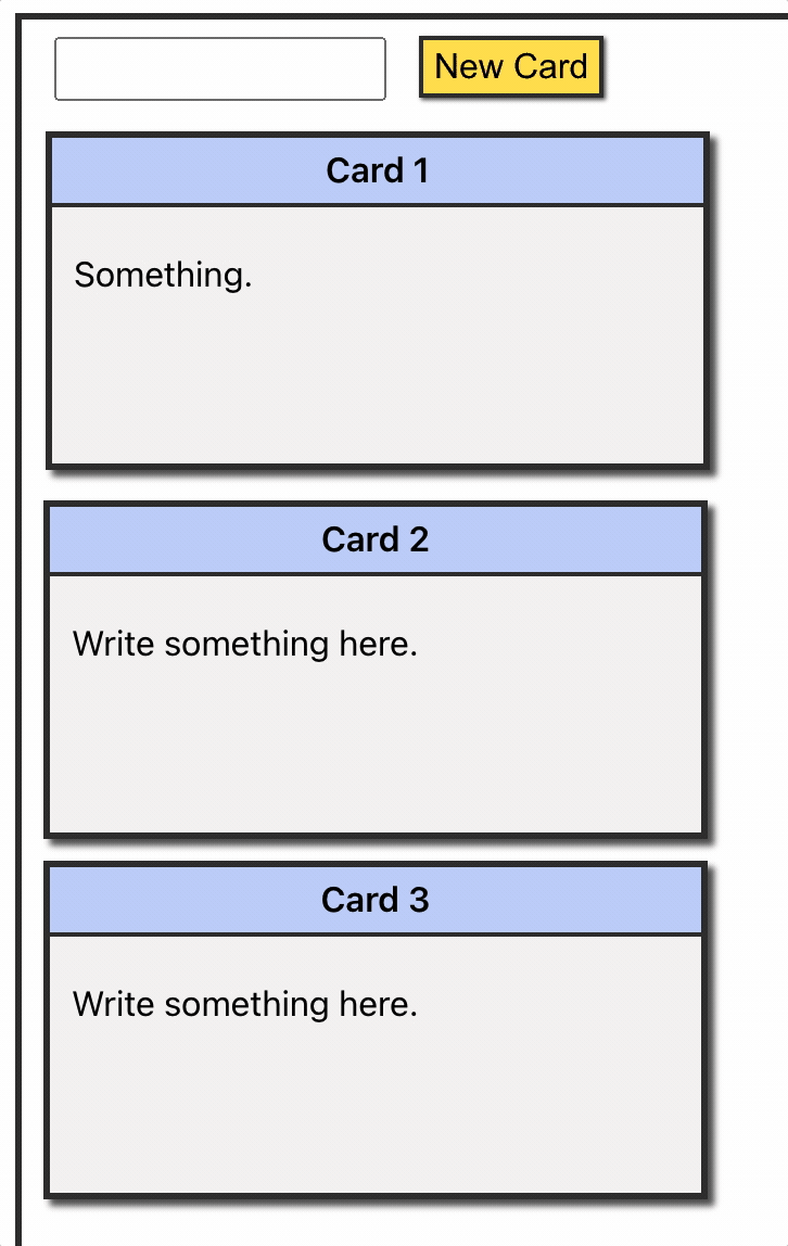
Creating a function to add cards
Now, we can add some more interactivity to the app by creating the capability to add new cards. To do this, we'll create a form in the UI to add a new card and a state variable to store that new card. Then, we'll create a function that takes the contents of that variable and adds it to the existing list of cards.
First, add a simple form to List.jsx. The form contains a text box where the user can type a name for a new card, along with a button to add the new card:
To improve the form's appearance, we can add some more styles in App.css:
This form has no functionality yet, but we'll hook it up so that typing in the text box sets the new card variable, and pushing the button adds that new card to the list.
In the <List> component, create a new state variable to store the contents of the text field as the user types before they're added to the cards array as a new card:
As you can see in the above code, the initial value of newCard is just an empty string.
Next, in the <List> component, create a function that updates the cards array to include this new card. This function will be called when the "New Card" button is pressed. It will take the contents of the newCard variable to add to the end of the cards array:
This function uses the spread operator to create a copy of the cards array and stores it in a temporary variable called tempArr. It then creates a new card object using the value of newCard (which will be a title chosen by the user) and an ID. Then, it pushes that card object to the temporary array, sets cards to that array, and clears the value of newCard.
Finally, we need to connect the form so that when the user types in the text field and presses the "Add Card" button, their card is added to the cards array. This change in the array will trigger a re-render and add their new card to the UI. To do this, make the following additions to the form in List.jsx:
This code sets the value of the text field as the value of the newCard variable. As the user types, that value is changed using the setNewCard function. Then, when the button is clicked, the addCard function is called.
We can now add new cards and drag them around to reorder them.
Making the cards editable
Next, we'll make the text within the draggable cards editable. To achieve this, let's use conditional rendering to show a text box when the user is editing and show a <p> element containing what they typed. We'll use the useState hook again to store text typed by the user.
To do this, let's make a few changes to Card.jsx.
First, import useState from React. Since we already wrote code to import useRef, the edit will look like the following:
Next, create two state variables using useState:
The first variable will store the text entered by the user and allow us to set that text. The second stores a Boolean value that represents whether the user is currently editing the text.
Next, let's make it so that the user can click the <p> element on the card to edit the text. After editing, they can click on a "Save" button to save the text.
To accomplish this, in the <div> with the content class, replace the placeholder text with the following:
This code uses a ternary operator to check to see if isEditing is set to true. If it is, it returns a <div> containing a <textarea> that, when typed in, sets the value of text to what the user types. Double-clicking clears the current text.
There's also a button inside this <div> that sets isEditing to false when clicked, indicating that the user is done changing the text.
If isEditing is false, a paragraph is displayed containing the value of the text variable. Clicking this paragraph sets isEditing to true again.
We can also add styles to the <textarea> element by adding the following to App.css:
Here's a new editable card in action:
Giving the cards a handle
Now that clicking a section of the card indicates that the user wants to edit the text, it might make sense to add a "handle" to drag the card. This will help prevent the user from accidentally triggering the editing function. Luckily, adding this feature is easy with React Draggable.
Simply change the <Draggable> component to look like this:
This code makes it so the user can only drag the card by clicking the <div> element with the class name header:
And that's how to use React Draggable components. Although React Draggable components are easy to visualize and move around, they can be challenging to customize and are more suited for simple use cases.
If you're looking to build and customize complex UIs easily, then Airplane is a better solution for you.
Airplane: an easy way to build and customize UIs
Airplane is the developer platform for building custom internal tools. Airplane Tasks are single or multi-step operations that anyone on your team can use. Airplane Views allows users to build complex UIs within minutes using code.
Airplane supports an extensive component and template library out-of-the-box that makes it simple for users to get started. Engineers can also utilize third-party components or easily create their own components in Airplane.
If you're interested in building your first Airplane UI using out-of-the-box components within minutes, sign up for a free account or book a demo.
If you are at a startup that is series A or earlier with under 100 employees, check out our Airplane Startup Program for $10,000 in Airplane credits for a year.
Author: Veronica Stork
Veronica Stork is a technical writer with hands-on experience in software engineering. She is passionate about creating clear documentation and tutorials that make complicated concepts easy to understand.
