Material Design has been a prominent standard for building user interfaces since its inception. Google developed Material as a design language and released it in 2014. As the creator and maintainer of the Android operating system, Google also integrated the Material design system into that platform, leading to its worldwide dissemination. Material offers an optimal user experience and is actively maintained, making it a great solution for designing web apps.
The React Material UI library is detailed and well maintained. It's a practical option for React developers looking for a stable design system to base their app's design on. Some of the key benefits of using Material UI in React apps include:
- Consistent and professional design
- Highly customizable look and color themes
- Special focus on accessibility
- Powerful theming capabilities
- Responsive design at the core
- Active maintenance
In this article, we'll walk through how to install Material UI in a React project and look at some of the most popular components from the library.
Using Material UI in Your React Project
Getting started with Material UI in a React project is fairly straightforward. The library is available as a package on the npm Registry. The Material UI docs describe a few different installation options, but the following command should install Material UI in a React project in most cases:
This installs the React Material UI package along with Emotion packages for handling styling.
Material UI Components
Now that we've installed Material UI in the React project, let's take a look at some of the fundamental components of the Material design system. The following sections use examples pulled from React SaaS Template, an open source React project that uses Material UI. The template's source code is available in this GitHub repo.
Surface
Surfaces are the foundation of Material Design. A surface is a UI element that acts as a container where we can render content. The default surface is 1 dp in thickness, and surfaces are stacked one over another in the view. Surfaces can cast shadows and reflect light.
This section introduces a few commonly used components for building surfaces.
Paper
Paper is the fundamental way of showing backgrounds in Material UI. Most Material components use paper as the base and then add styles and features on top of it. In the following screenshot, we can see paper in both the app bar and the side navigation bar of the website:
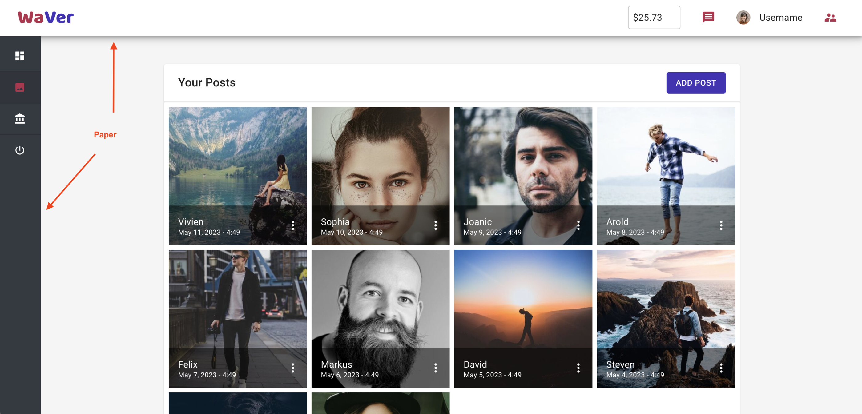
We would rarely need to use this component in designs. However, it can come in handy when building custom components from scratch.
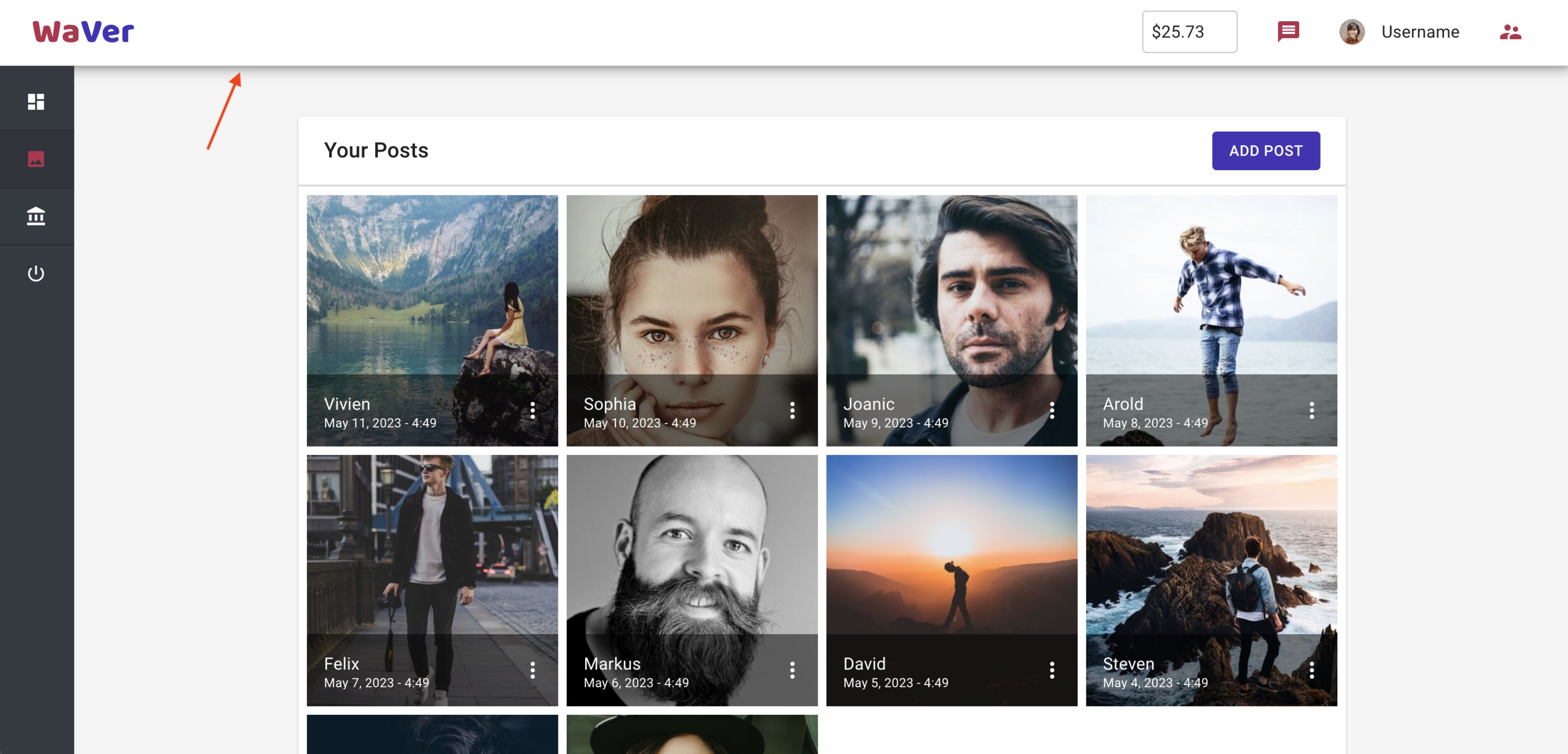
Card
Cards are used to show content and allow actions related to a single subject. We can use cards in a grid to build complex but clean and responsive dashboard UIs.
The following is an example of two cards from the React SaaS Template dashboard:
The code for these cards is here.
The pricing section of the below homepage uses stylized cards:
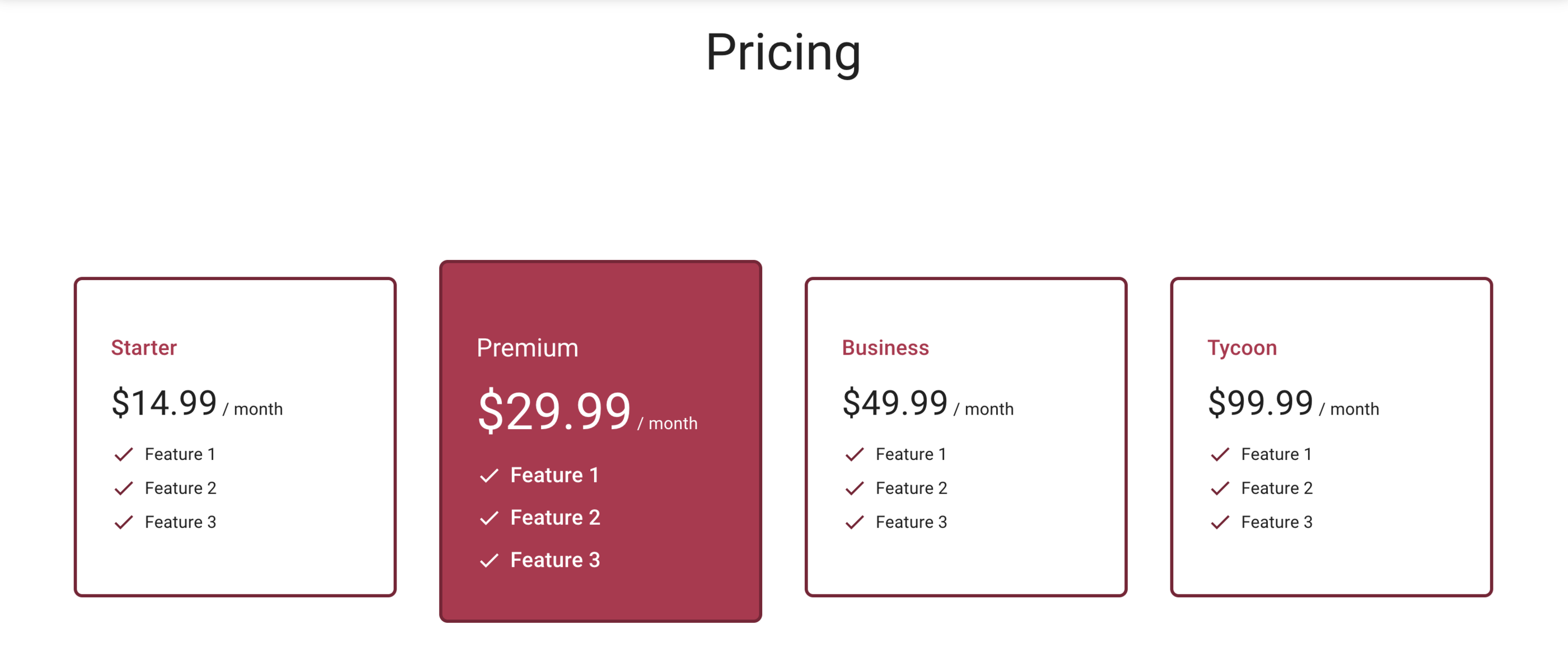
You can view the code for these cards here.
Accordion
Accordions are expansion panels that enable users to hide or show content on the page. To do this, they utilize two states that the user can toggle between: one that displays the content and one that hides it. In the example website, accordions let the user hide or display different setting options:
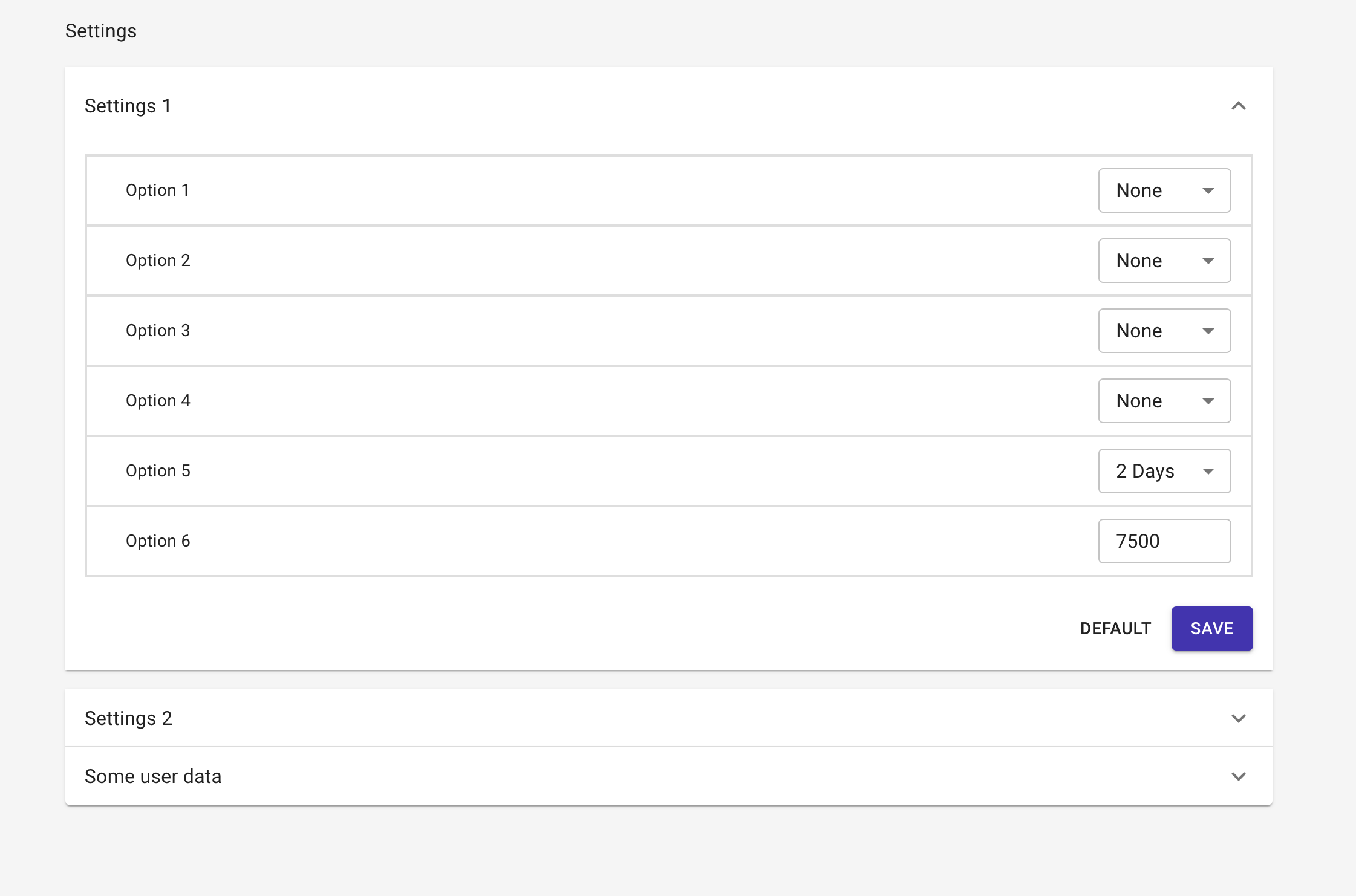
The source code for this accordion implementation is here.
While accordions are a great way of organizing components on the screen and providing users with control over how their views look, their overall usage has been on the decline. Nevertheless, they are still prominently used in dashboards and other similar use cases.
App Bar
App bars are a common feature across design systems. Even if we don't have a prominent horizontal app bar, it's still common to include a title or logo for the website at the top, along with some actions or navigations on the right. This combination roughly resembles the structure of an app bar.
Here's what the Material app bar looks like on the example website:
The code for this app bar is here.
An app bar is a must-use component for better UX, especially if you do not use other navigation components like a side drawer.
Layout
Layouts allow us to arrange components on the screen. We can use a layout to set the size, spacing, and padding of the design components.
Box
The box component is meant to be a wrapper for other components. For instance, a box component is used to group the two buttons in the accordion:
You can find its code here.
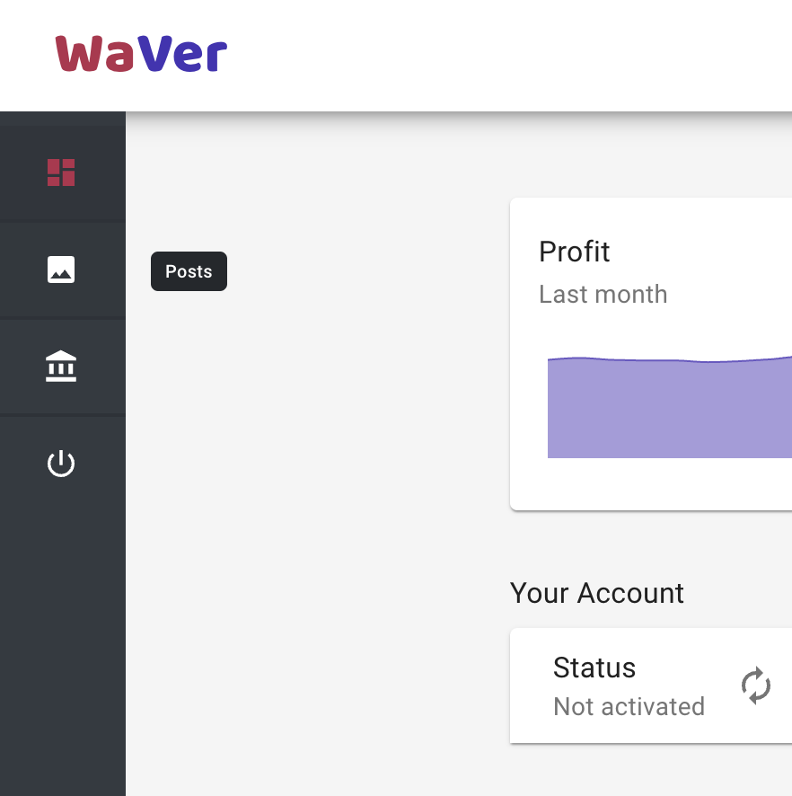
Grid
The grid component is a very commonly used layout component that can help us build layouts of almost any shape or design. The most common way of using a grid is to display a grid of components in it, as seen on the Posts page of the example website:
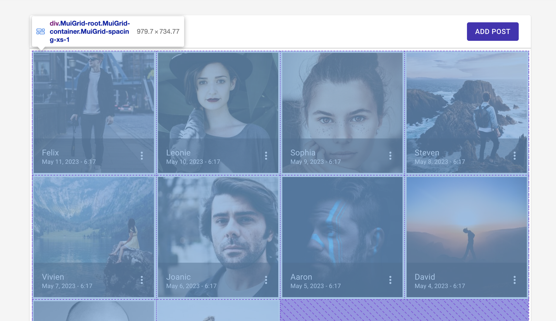
The source code for implementing a grid is here.
Grids can be used to make much more complex yet responsive designs as well. Users often find themselves using grids when designing layouts.
Data Display
Web apps often need to display data to users. There are multiple ways to do so, such as by showing text, images, or tooltips. This section will list a few popular components that Material UI offers to implement data display.
Typography
Typography components are widely used to display text of all scales and sizes on the screen. They serve as an alternative for <h1> through <h6> tags as well as <p> tags and allow users to easily and consistently format text across a website. The example website below uses various types of typography components to render text in the features section of the homepage:
The template's repo contains multiple instances of typography usage, such as this one.
We should use typography whenever possible to ensure that the website content is semantically correct (as in, it uses the right HTML tags for all types of content), as it can help us in SEO and other related fields.
Avatar
The avatar component is used to display images (usually related to users or profiles) in a small circle, slightly bigger than icons. It helps users know how to get to their profile pages or who the authors of certain content on the website are.
The example website uses the avatar component in its app bar to show the logged-in user's profile picture:
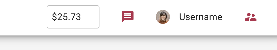
Find the source code for implementing an avatar here.
We should consider using avatars if we are building an app that involves showing data related to multiple users or profiles on the same pages/components.
Tooltip
Tooltips are handy little notes that pop up when a user hovers over something. When building an app with multiple components on the screen at the same time, we might need to avoid hard-coding help information on the screen to reduce visual clutter. In such cases, we can use tooltips to show users additional help information. The example website uses tooltips to show the name of the page that the user will navigate to if they click an icon in the side navigation bar:
We can find the relevant code here.
When building complex UIs such as dashboards or control panels, we should always consider adding help text via tooltips for a better user experience.
Icon
Icons are an important part of any design system. Icons help us convey information without writing text. This way, we less space on the screen and can improve our brand's presence by customizing the icons.
The example website below uses Material icons to denote "activate/deactivate" and "delete" actions for user records:
The template's repo implements icons multiple times, such as this one.
Make sure to use icons wherever possible to improve the user experience and free up space the screen.
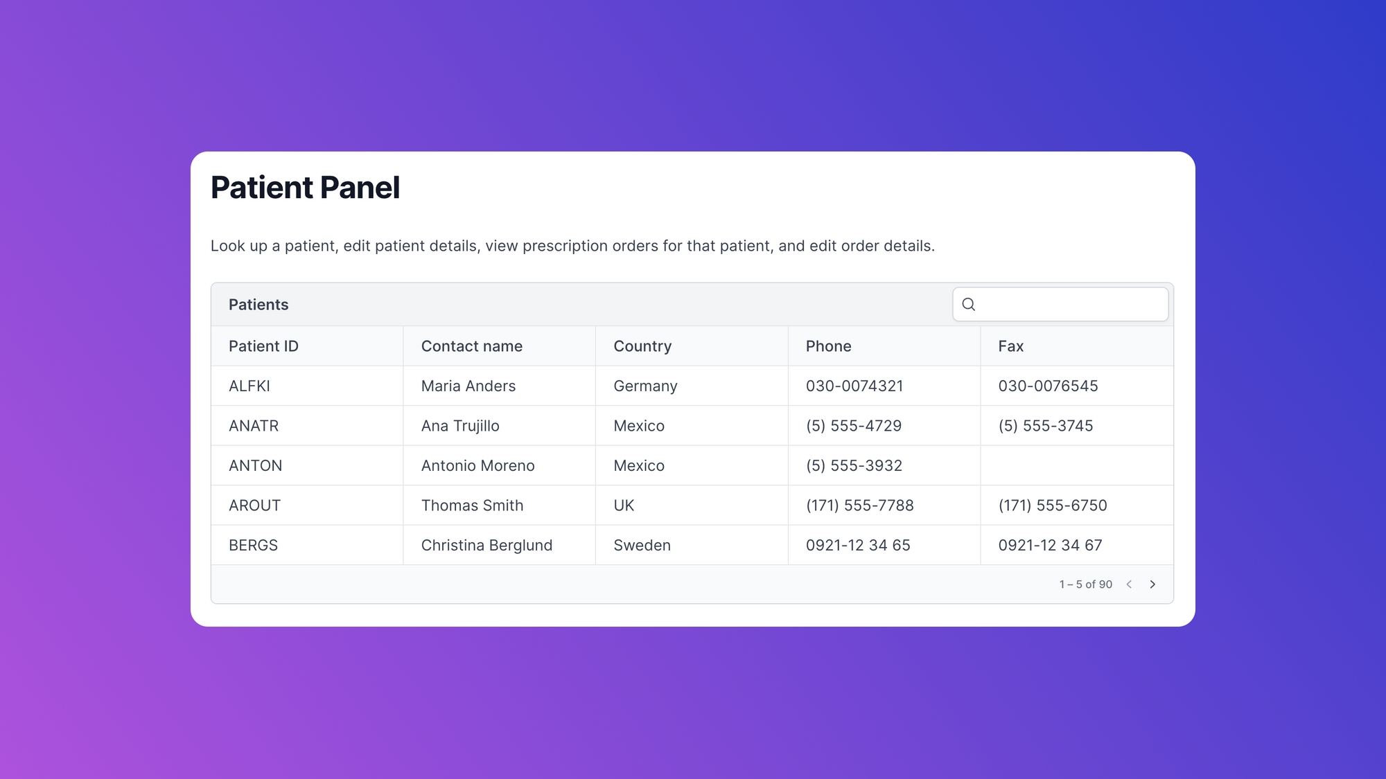
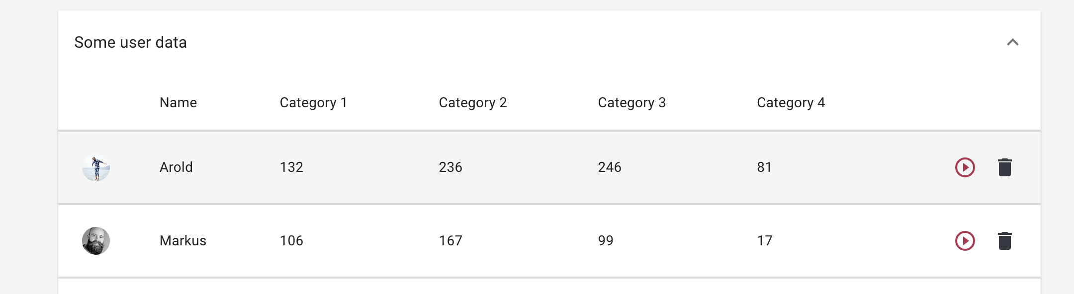
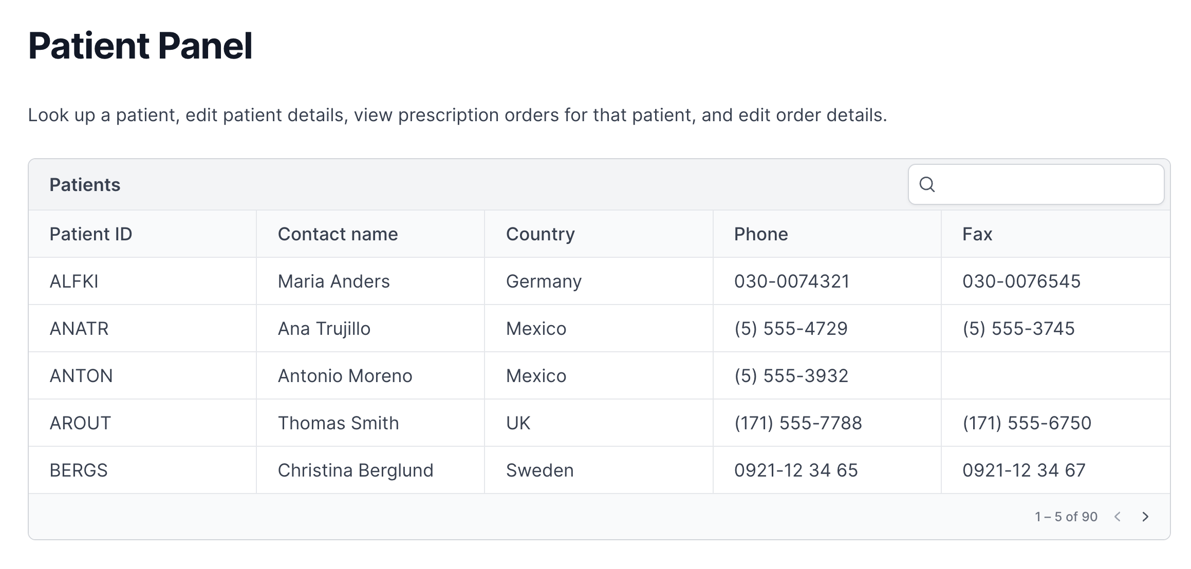
Table
Tables are an important way of presenting data to users in an easily readable format. Material tables support additional functionality out of the box, like pagination, sorting, and selecting. The example website uses the table component to track transactions:
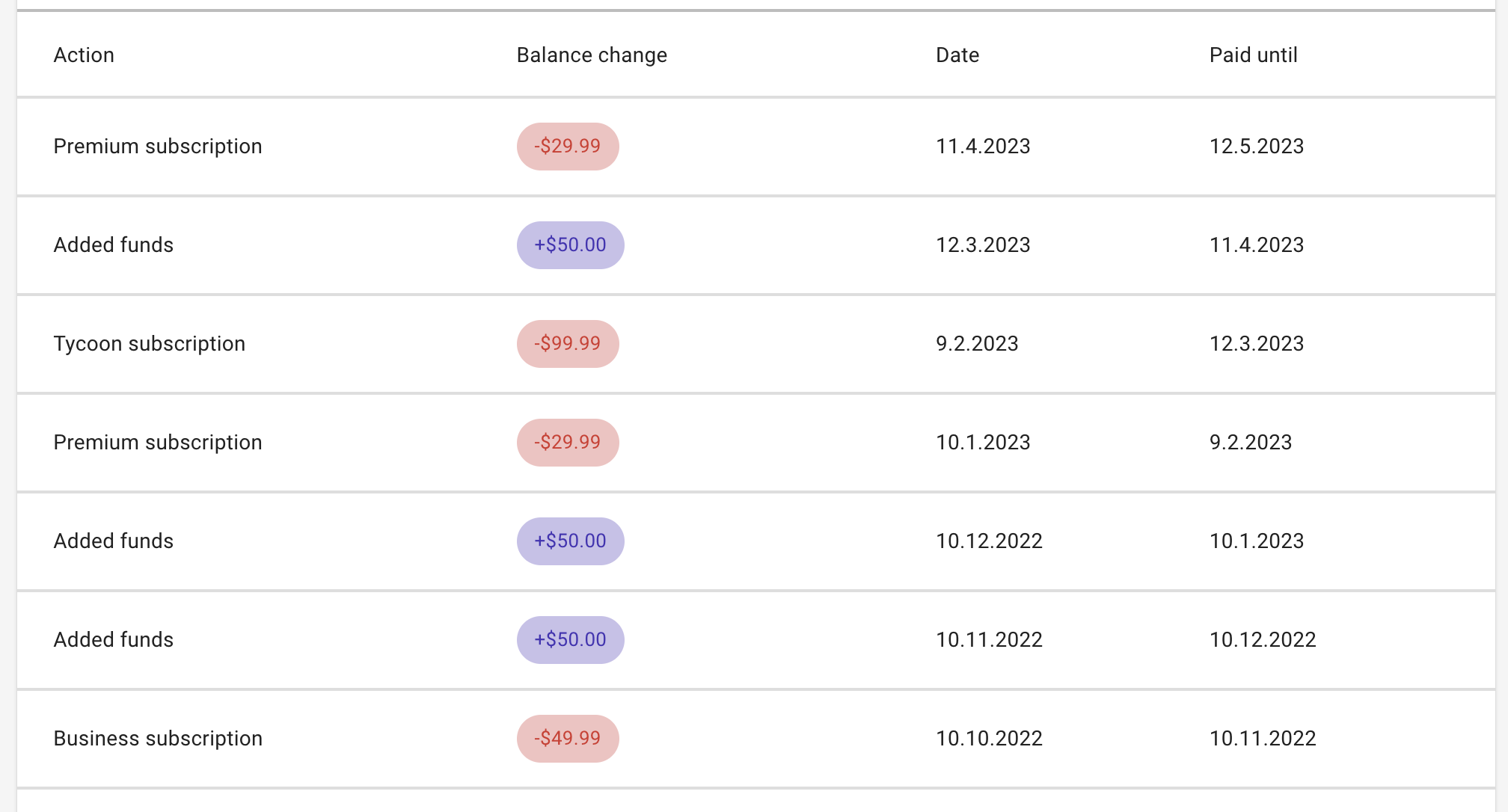
You can find the source code for its implementation here.
Needless to say, users will end up using the table component in one way or another when working with data-based apps in React.
Input
Apart from showing data, web apps also collect data. To do that, we need input elements. In this section, we'll see how Material UI implements commonly used input elements like the text field and the dropdown field.
Text Field
The text field is one of the most important ways of collecting textual data from the user. Material enhances the <input> HTML element through its various <Input> components, such as OutlinedInput or TextArea.
The example app below uses the TextArea component to allow users to write blog content when creating a new post:
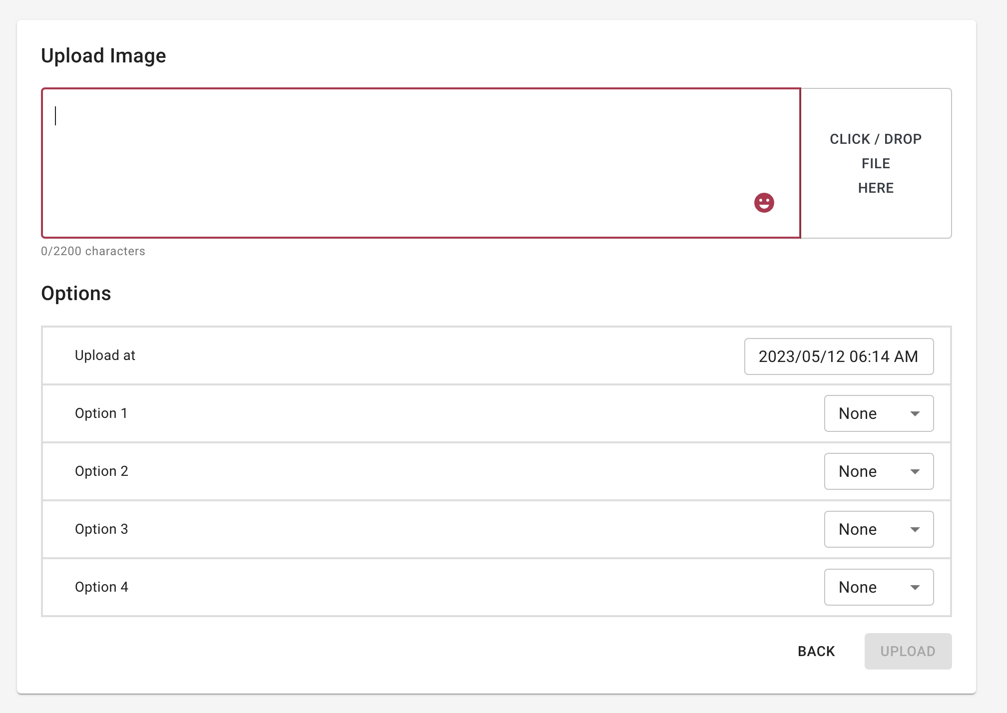
Find its code here.
Input components form the backbone of data collection in React apps, and using Material's input components will give us additional benefits like simplified validation, quick feedback to the user (such as errors), etc.
Button
The button component is an integral part of web forms and design in general. It allows users to initiate actions, such as submitting data or refreshing pages. The Material button is standardized, handles multiple states well (idle, pressed, disabled, etc.), and can be set up easily. The example website below contains many different implementations of buttons. The following buttons allow the user to reset to default settings or save changes:
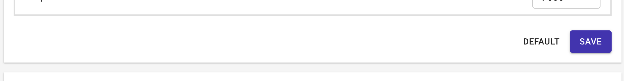
The source code for the implementation of the buttons shown above can be found here.
If we're using a text field or other input components, we will most likely end up using buttons as well. For instance, we will need a button to allow users to submit a form after filling it out. We can also use buttons to allow users to navigate to different parts of the website, such as docs or support (though we will probably use IconButtons in such cases).
Switch
A switch is a handy input component to handle binary input. Apart from handling input, switches are a decent design choice for showing the current state of a binary variable as well. This is why switches find a lot of use in preferences management and control panels, in addition to forms. The example website uses a switch to denote the activation status of the SaaS website:
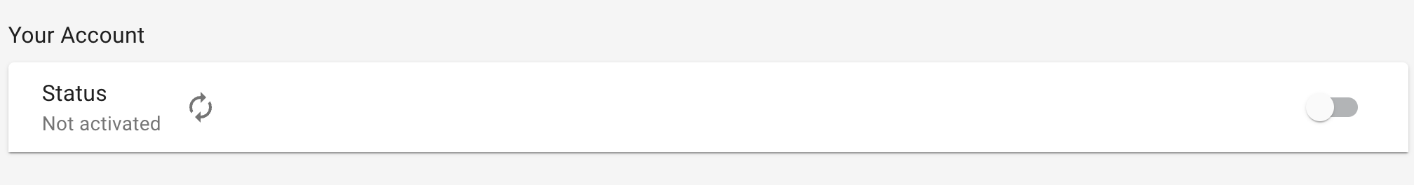
The code for the above can be found here.
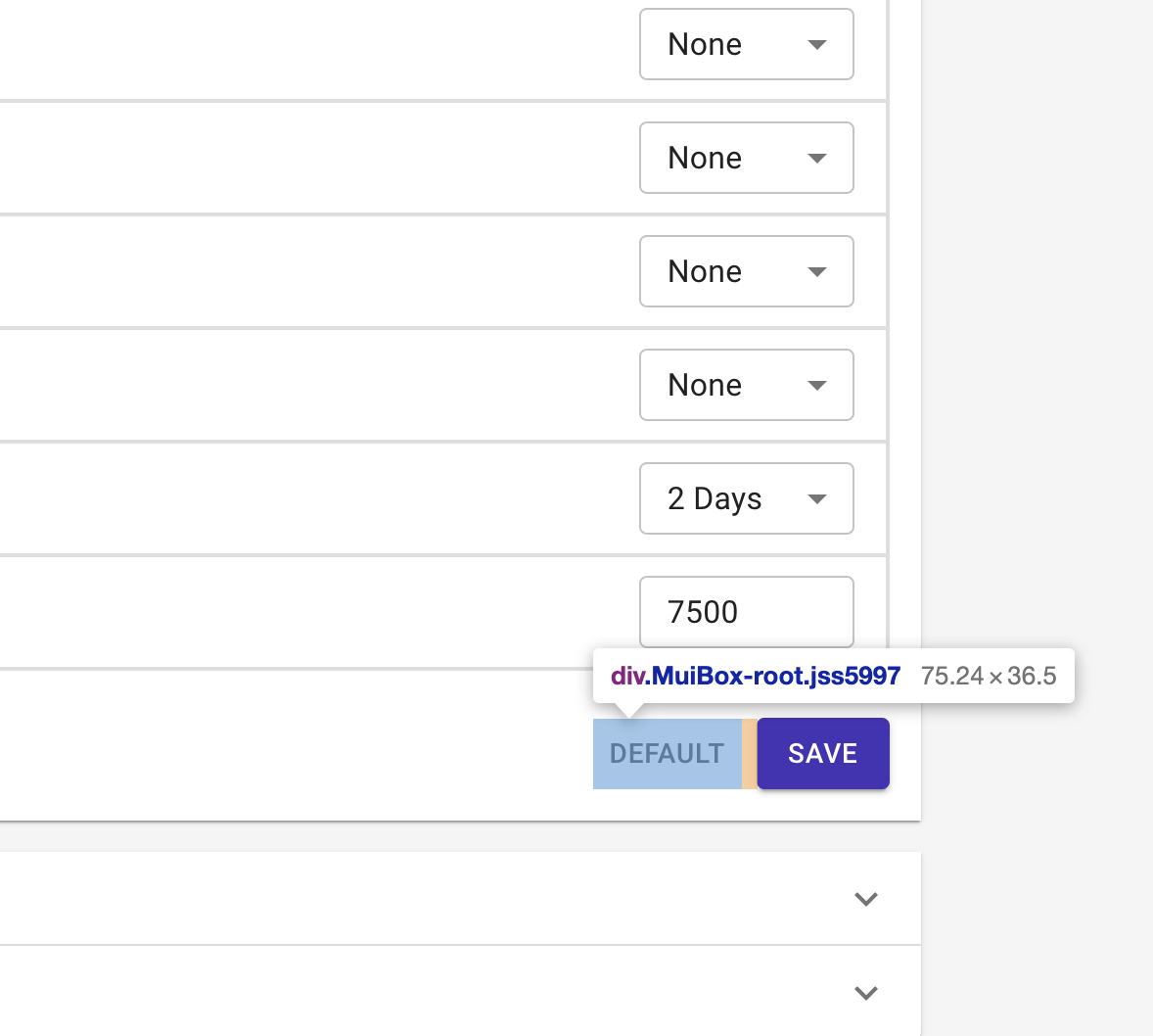
Select
The select component is used to create dropdown lists of options that a user can choose from to provide input. It's handy when we want the users to choose from a fixed set of inputs or when we want to save them from typing long text as input.
The Material select component makes it easy to validate input, add labels, and customize options. One way the example website uses select components is by limiting the input for setting options:

You can find its code here.
Feedback
When a user interacts with the app, we need to communicate the result of the interaction back to the user. Feedback components like snackbars and dialogs can help us do that.
Dialog
A dialog is a type of modal we can use to ask users for additional information as part of an action or convey a detailed piece of information as part of feedback. Dialogs are interruptive in nature, so they should be used only when necessary.
The example website uses a dialog to ask for card information when the user tries to add a balance to the account:
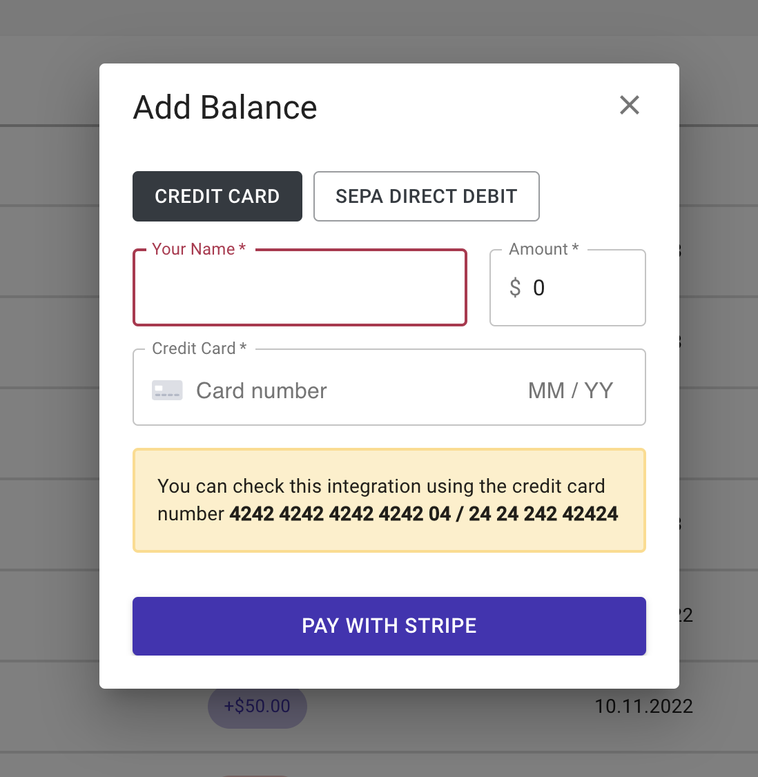
You can find its code here.
Snackbar
Snackbars are small components that pop up to convey a small piece of textual information to the reader for a short period of time. For instance, the example website implements snackbars to let the reader know when changes are saved:
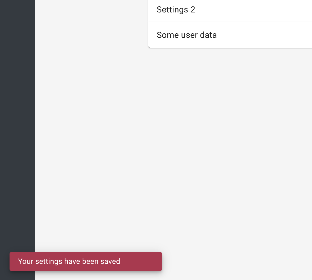
You can find the relevant code here.
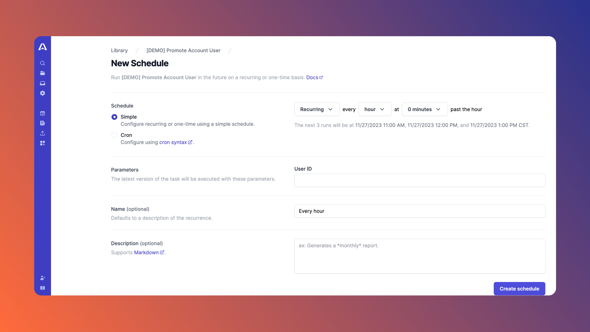
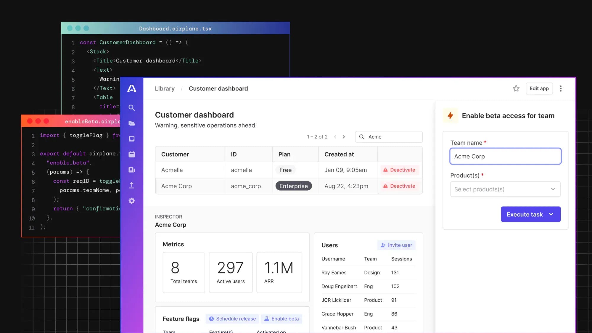
Introducing Airplane: Build and customize React-based UIs within minutes
Airplane is the developer platform for building custom internal tools. With Airplane, you can transform scripts, queries, APIs, and more into powerful workflows and UIs. If you're looking to build a Material-based UI, Airplane Views is a good fit for you.
Airplane Views is a React-based platform to build custom UIs. Users can utilize Airplane's extensive component and template libraries to get started quickly. Since Airplane is code-first, you can easily build custom components or extend to third-party libraries. Airplane Views also provides an easy-to-use CLI to quickly build Views, and offers an environment to deploy them when done.
In addition to Views, Airplane offers Tasks, which are single or multi-step operations that anyone on your team can use. Airplane also features strong defaults, such as job scheduling, permissions setting, audit logs, and more.
To try it out and build your first UI within minutes, sign up for a free account or book a demo.
Author: Kumar Harsh
