
As a React developer, one might be tempted to use an external library to add a tooltip to a React application. While using a library works well, building a tooltip from scratch allows for greater flexibility and customization of the tooltip's functionality and styling. Going through the process of building a tooltip can also help developers understand some of the core concepts like components, props, and state.
Creating a tooltip can help avoid adding unnecessary dependencies to the project. In some cases, just a few extra lines of code can solve a problem without the need for an external library. This can ultimately improve the performance and maintainability of applications.
React is a component-based library. Components are reusable and independent pieces of code that have their own logic and state. In this article, we'll explore how to create a custom tooltip component using React. Specifically, we'll walk through how to pass state between components to control the visibility and content of the tooltip. We'll also work with CSS to style the tooltip and make it look and behave the way we want.
Creating a React Application with a Custom Tooltip
In this tutorial, we'll set up a new React app using the create-react-app command. We'll then walk through how to create a tooltip component and style it with CSS. Finally, we'll add interactivity to the tooltip using React, allowing a user to hover over the wrapped elements and see the tooltip text.
Prerequisites
To follow the tutorial, ensure you have Node.js installed on your machine. To build a custom tooltip, ensure you have some basic knowledge of React and CSS. If you're new to React, start by reading the official React documentation and completing some beginner tutorials. For CSS, you'll need a basic understanding of how to create and apply styles to HTML elements.
Creating the React App
Let's start by using the create-react-app command in your terminal to create a React app. First, ensure that Node.js is installed on your computer by opening the terminal and typing the following command:
Node.js needs to be installed because Create React App is a command line tool that uses Node.js to generate and manage the React app's files and dependencies. If you see a version number, it means Node.js is installed. If not, you can download and install it from the official website.
Once that is confirmed, open the terminal and navigate to the directory where the new React app should be created. Then, run the following command:
This command creates a new directory with the name react-tooltip and sets up a new React project inside it.
After running the command, Create React App will download and install all the necessary dependencies for the React project.
Once Create React App has finished setting up the project, run the following command to navigate to the app's directory:
If we open the root directory of the project, we should see the following folders and files:
Run the following command in the terminal to start the React app:
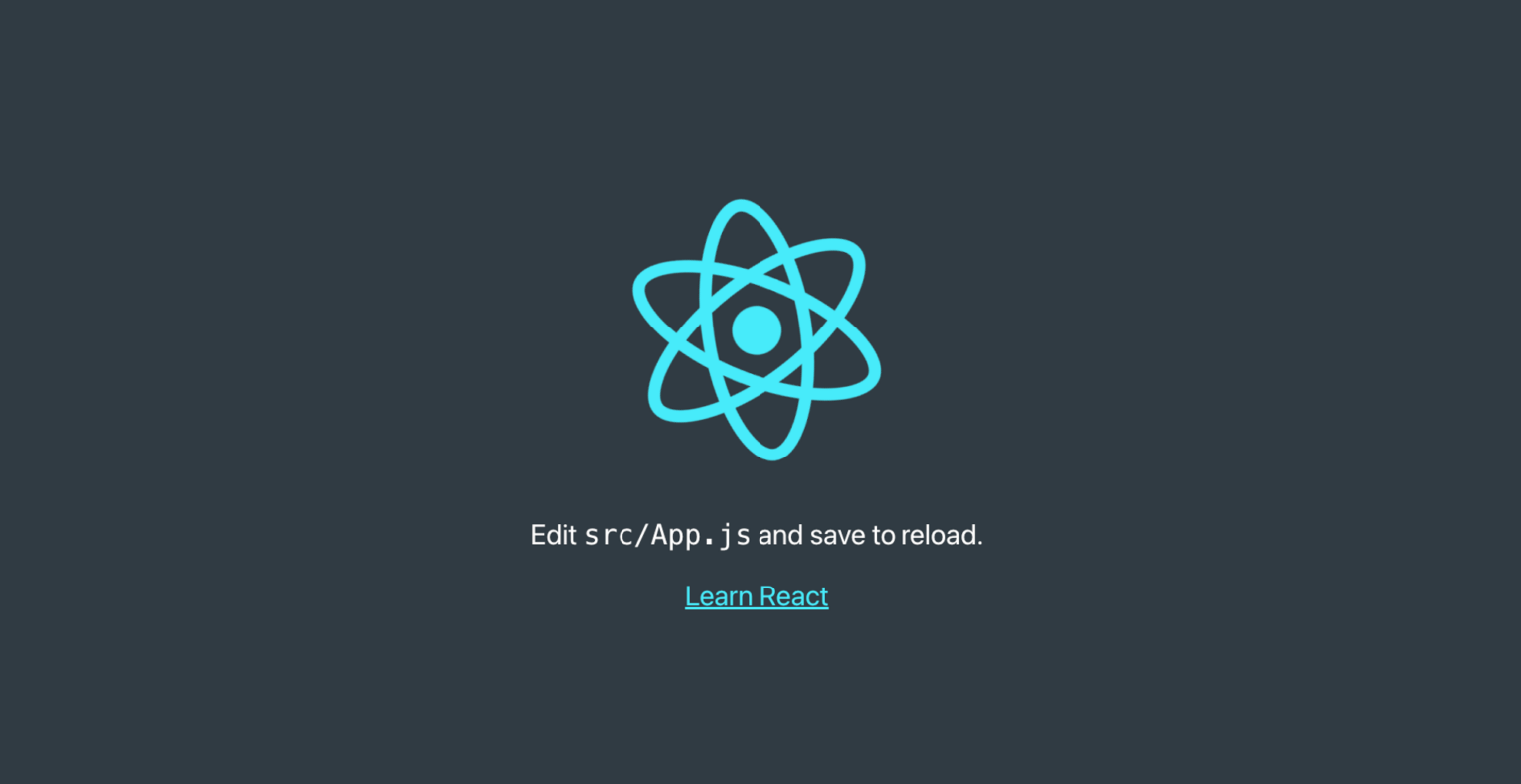
This starts a development server that automatically reloads the app whenever we make changes to the code. We can access the app in a web browser by visiting http://localhost:3000, and it should display something similar to the below image:
We now have a fully functioning React app set up and can start building a custom tooltip.
Creating and styling the tooltip
To create the tooltip component, first create a folder in the src directory called components and create a file within it called Tooltip.js. Copy the following code into the Tooltip.js file:
This defines a new functional component called Tooltip that accepts two props: text and children. The text prop is the content of the tooltip, while the children prop is the element that the tooltip is associated with.
Next, create a CSS file to style the tooltip. In the src directory, create a new file called Tooltip.css with the following code:
The first part of the CSS code sets the position of the tooltip container and its child elements. The tooltip container has a position property set to relative, which means that the tooltip's position will be relative to the position of its parent element. The display property is set to inline-block, which means that the tooltip will be displayed inline with the rest of the content, but it will also have its own block-level box.
The second part of the CSS code styles the tooltip itself. The tooltip's class is tooltiptext, and it's hidden by default (visibility: hidden). When the user hovers over the heading, the tooltip becomes visible (visibility: visible) and its opacity is set to 1 (opacity: 1).
Adding interactivity with React
Now that we've created and styled the Tooltip component, we can use React to make it interactive. In the App.js file, we can remove the default code that came with the create-react-app boilerplate and instead import the Tooltip component. Then, wrap the Tooltip component around the element that we want to add the tooltip to. This way, when a user hovers over that element, the tooltip will appear. This is an example of how React allows us to easily add interactivity to any web application.
For example, if we want to add tooltips to a heading element and a paragraph element, we can do the following:
In the example provided, the Tooltip component is imported into the App.js file and then used to wrap around the <h1> element and the text within the <p> element. The text prop is passed to the Tooltip component and specifies what text should appear in the tooltip when the user hovers over the wrapped element.
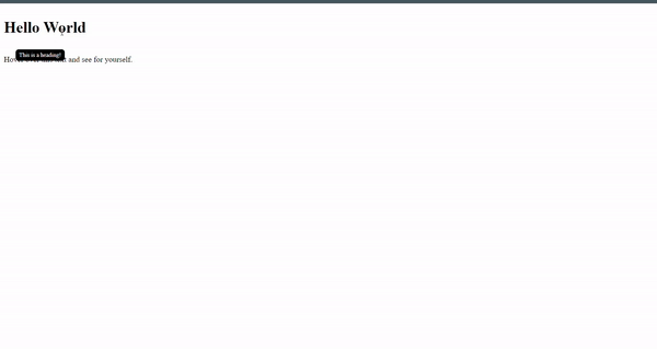
In this case, the <h1> element is wrapped in a Tooltip component with the text prop set to "This is a heading!", and the <p> element is also wrapped in a Tooltip component with the text prop set to "this is a sentence". This means that when a user hovers over the heading or the sentence, the respective tooltip will appear with the specified text.
This approach allows for easy and flexible use of tooltips across various elements in a React application. By simply importing the Tooltip component and wrapping it around any element that requires a tooltip, developers can easily add interactivity and enhance the user experience of their application.
To see the created tooltips, navigate to the browser and hover over the heading and paragraph to see their respective tooltips:
React Tooltip libraries
If you'd prefer not to create custom React tooltips or simply don't have the time, preexisting tooltip libraries in React provide a convenient and efficient solution for adding tooltip functionality.
ReactTooltip
ReactTooltip is a popular tooltip library that offers a range of customizable options. It allows you to easily create tooltips with different content, positioning, and styling options. If you want flexibility and a wide range of customization options, such as different positioning or styling options, react-tooltip is a good choice.
rc-tooltip
rc-tooltip is a lightweight tooltip library that focuses solely on creating tooltips. It may not have as many features as other libraries, but it is a good choice if you're looking for something simple and easy to use.
Tippy
Tippy.js is a versatile library that offers more than just tooltips, with popovers, dropdowns, and menus among its features. Its tooltip options are exceptionally customizable, with a wide range of options available. Tippy is a good choice when you need a more comprehensive solution for not just tooltips but also other floating UI elements like popovers and menus.
Floating UI
Floating UI is a powerful React library that provides the building blocks for creating highly customized floating UI components like tooltips, popovers, dropdown menus, and more. It's built on top of @floating-ui/dom, which provides anchor positioning and interaction primitives. The library takes an accessibility-first approach, ensuring that all building blocks are optimized for accessibility and work with assistive technologies.
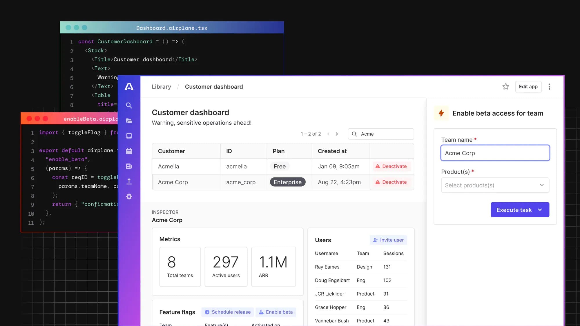
If you're looking to build robust UIs in React, then consider using a solution like Airplane.
Introducing Airplane: build React-based UIs quickly
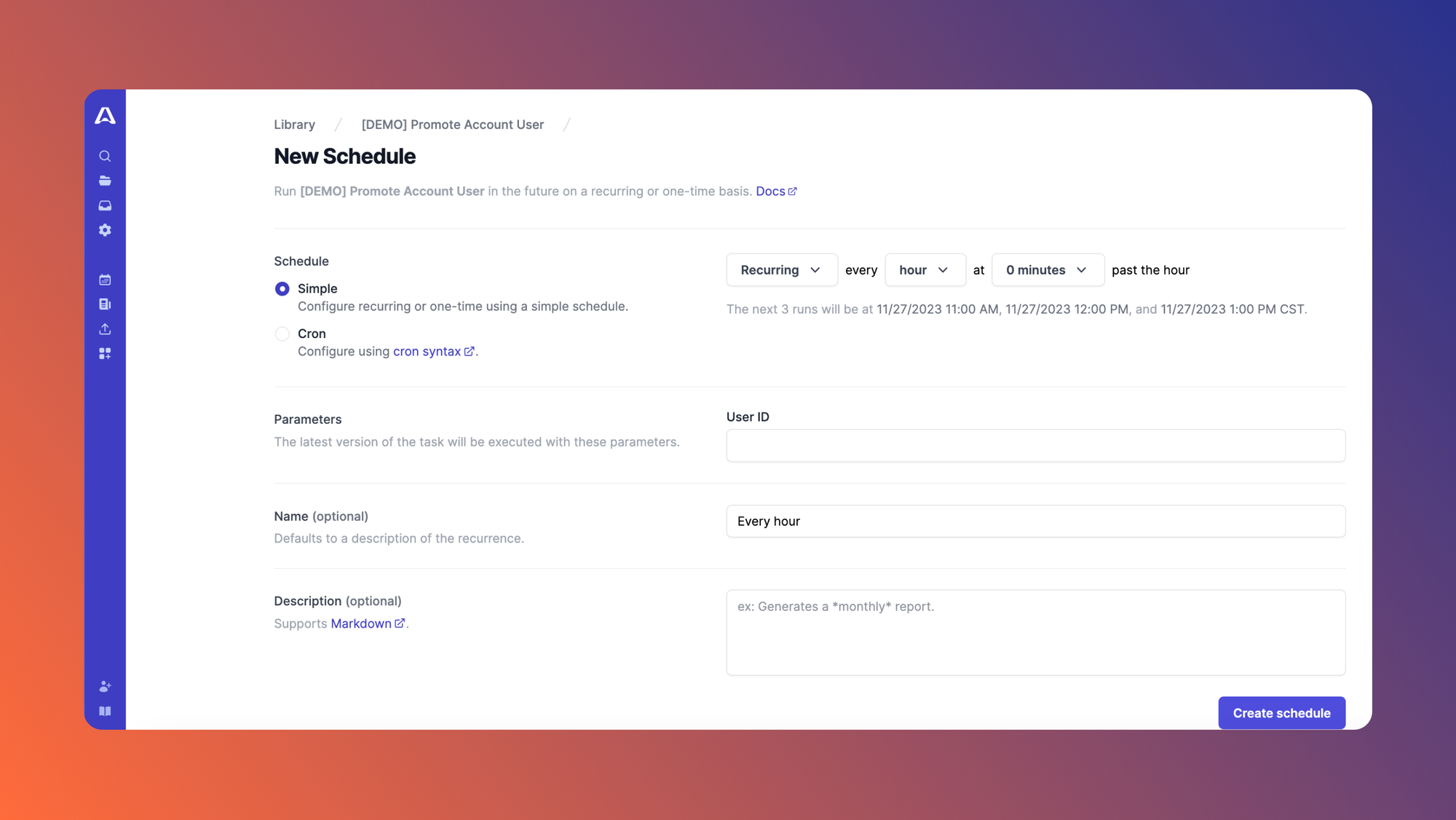
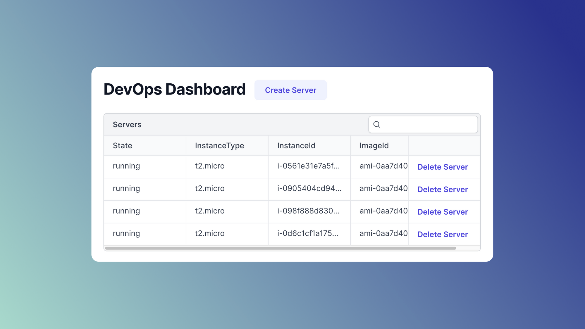
Airplane is the developer platform for building custom internal tools. With Airplane, you can transform scripts, queries, APIs, and more into powerful workflows and UIs. The basic building blocks of Airplane are Tasks, which are single or multi-step functions that anyone can use. Airplane also offers Views, a React-based platform for building custom UIs. With Views, you can build admin panels, customer dashboards, database dashboards, and more.
Airplane offers an extensive pre-built component library and template library that make it simple to get started. It also offers the flexibility to personalize UIs using both custom and third-party components. Airplane also has strong built-in capabilities, such as job scheduling, audit logs, and permissions setting.
To build your first React-based UI within minutes, sign up for a free account or book a demo.
Author: Marshall Chikari
Marshall is a software developer proficient in Ruby on Rails, Java, PHP, HTML5, CSS, JavaScript, and React. He has worked in both independent projects and team settings.
