
Navigation bars, often referred to as navbars, are a crucial component of most web applications. They provide a structured and intuitive way for users to navigate through an application, enabling seamless movement between pages. However, the default navigation bars provided by various libraries and frameworks may not always cater to your project's unique requirements.
Creating a custom navbar enhances not only the usability of the application but also its aesthetic appeal. It allows you to tailor the user interface to match the application's overall design, provide a cohesive user experience, and infuse a unique brand identity.
In this article, we’ll walk through how to create a custom navigation bar using Material UI in a React application. We’ll set up a new React project, create a basic header component using Material UI, set up routing, and create a drawer component. Finally, we'll integrate everything to create a functional web application.
What is Material UI?
Material UI (MUI) is a powerful library that offers a range of features and benefits for web developers. Whether you're developing a simple website or a complex application, Material UI can streamline the development process and enhance the overall user experience. Here are some examples that demonstrate how Material UI's distinctive features and benefits can be utilized:
- Building mobile-first and responsive web experiences: Material UI provides mobile-friendly components that fluidly adapt to various screen sizes and devices. It also simplifies the creation of web solutions. This results in increased user interaction and decreased bounce rates, and it guarantees the web app or site maintains a visually pleasing appearance across all devices.
- Incorporating tailorable predesigned UI components: By incorporating tailorable predesigned UI components from Material UI, users gain access to a wide range of ready-made elements, such as buttons, forms, and navbars. These components are highly flexible, enabling easy customization to suit specific needs and requirements. This feature saves a significant amount of time that would otherwise be spent on designing and coding UI elements from scratch.
- Maintaining uniform design across collaborative projects: With its prebuilt components, Material UI offers a uniform design language that is deployable across all project pages and components in a collaborative environment and also ensures conformity to Material Design standards. This approach minimizes design-related disputes and inconsistencies during development, which in turn enhances the overall user experience by delivering a coherent and predictable interface.
- Creating an efficient development process: The extensive collection of prebuilt components and an intuitive API offered by Material UI streamline the web development workflow. Furthermore, Material UI is well-documented and actively maintained, ensuring developers stay updated with the latest features and improvements.
Implementing a Material UI navbar with drawer component
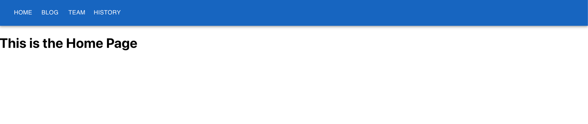
This tutorial provides instructions on implementing a Material UI navbar with a drawer component from scratch. We’ll create a navigation bar with three pages—Home, Blog, and Team—and utilize a drawer component to display additional navigation options. The developed app will provide a seamless and interactive user experience that's responsive and mobile-friendly.
Prerequisites
There are a few things we must complete before getting into the tutorial.
First, ensure that you have Node.js and npm (the Node package manager) installed on your system. To check this, open the terminal or command prompt and run the following commands to verify their installation.
This command will display the version of Node.js installed on the system:
This command will display the version of npm installed on your system:
If you see the version numbers for both Node.js and npm, it means they are successfully installed on your system. If not, download and install Node.js from the official website; npm will be installed automatically with Node.js.
We also need to create a new React project using Create React App by executing the following command:
This command generates a new folder with the specified name that contains the boilerplate code for a React application.
Change the current directory to the newly created project folder by running the following:
Start the development server by running the following command:
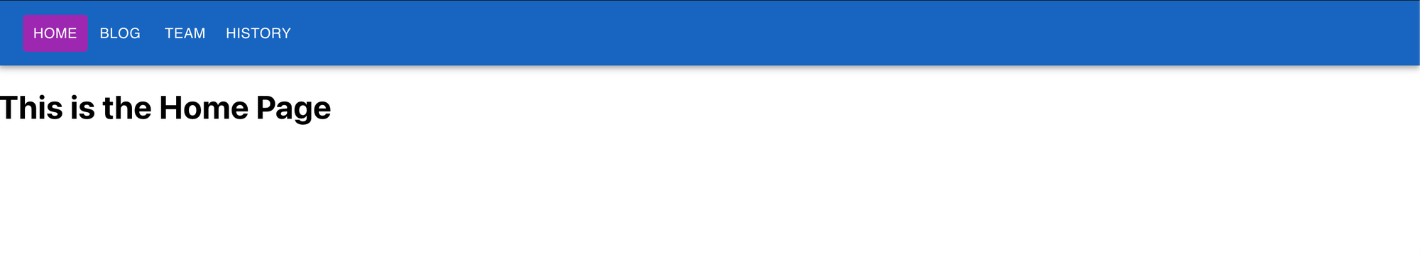
The React application should now be running at http://localhost:3000/:
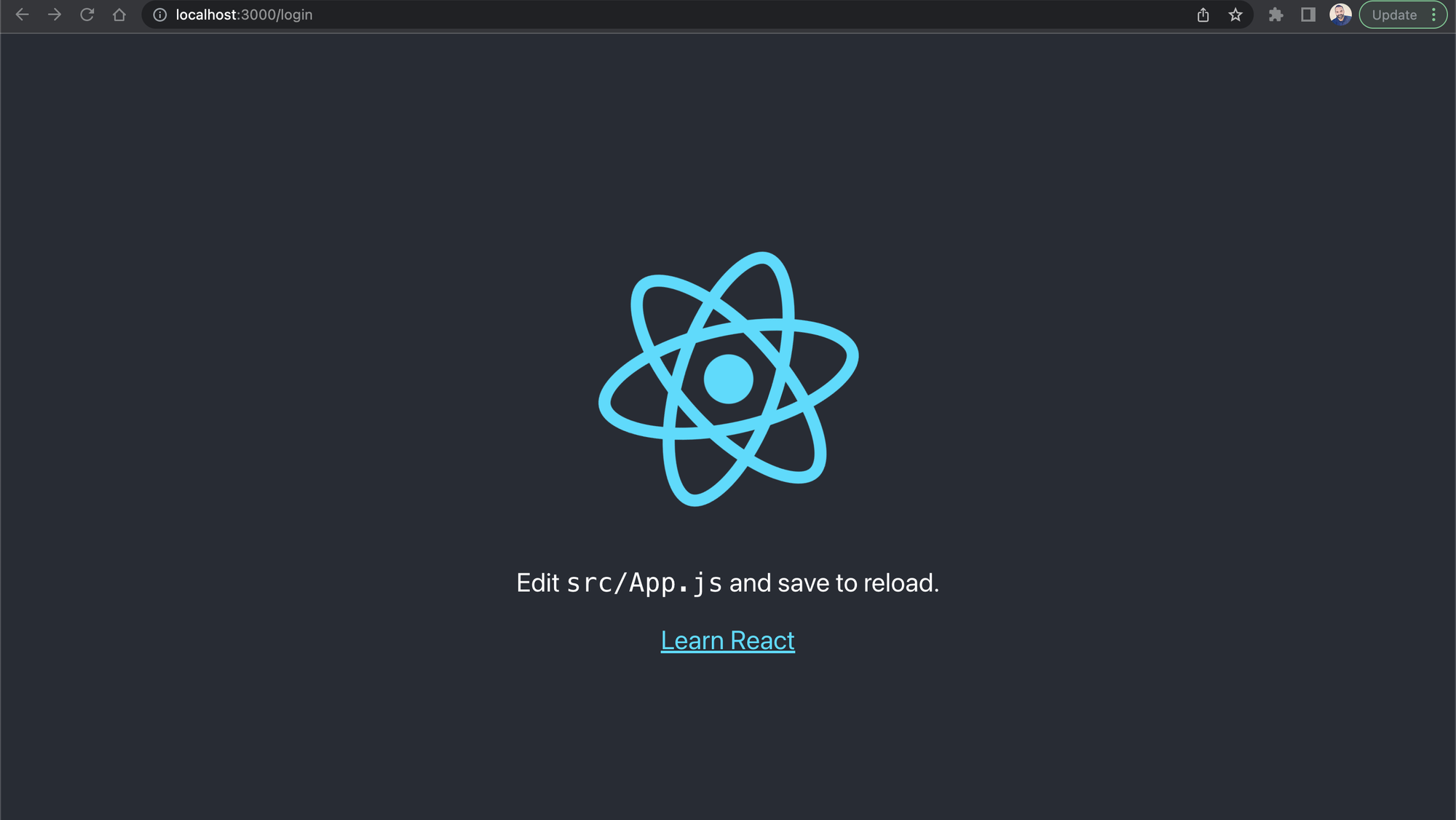
The page will automatically reload whenever we make changes to the source code.
Now that we’ve set up a React application, we can proceed to install the additional libraries required for this tutorial. Run the following command to install @mui/material, @emotion/react, @emotion/styled, @material-ui/icons, and react-router-dom:
This command will install the necessary Material UI packages for styling, icons, and managing React routes.
Creating pages
First we’ll start by creating basic pages for the Home, Blog, and Team sections.
Open the project in a code editor (such as VS Code), then create a new folder named pages within the src folder. Then, create three files inside the pages folder: Home.js, Blog.js, and Team.js. Finally, add the appropriate content to each file.
Add the following code to Home.js:
Add the following code to Blog.js:
Add the following code to Team.js:
Creating routes
Navigate to the src folder and create a new file named routes.js. In this file, configure the routes for the application by defining the appropriate routes for each page or component we want to display. Use the following code:
Creating a HistoryDrawer component
In the src folder, create a file named HistoryDrawer.js. In this file, import the necessary Material UI components and define the HistoryDrawer component:
This code creates a HistoryDrawer component for the React application. It uses Material UI components such as Drawer, List, ListItemButton, and ListItemText. The Drawer component acts as a sidebar that can be toggled open or closed by triggering the toggleDrawer function. This function and the current state of the drawer (open or closed) are passed in as props to HistoryDrawer. Finally, you export the HistoryDrawer component so it can be imported and used in other parts of your application.
Creating the navigation bar with the HistoryDrawer component
In the src folder, create a file named NavBar.js. In this file, we’ll import the necessary components and define the NavBar component:
The code defines a React functional component called NavBar, which uses Material UI to render the NavBar with the HistoryDrawer component. The navigation bar contains different navigation options, represented by buttons and labels. The navigation buttons utilize the Link component from react-router-dom to navigate to different pages in the application without reloading the page. The button with the label History is used to open the HistoryDrawer component, where you have a list of different history versions. The NavBar component is exported as the default export of the module, allowing it to be used in other parts of the application.
Combining the navigation bar and routing in your application
In the src folder, open the App.js file and import the necessary components and routes. Next, update the App component to include both the navbar and the routes we've defined:
The code defines the App component, which handles the routing of the application and renders the NavBar component. The Router component from react-router-dom manages the routing of the application, and the Routes component is used to render different components based on the URL path.
The routes array is mapped over to create different route components, each with a specified path and corresponding component. These routes are used to render the appropriate component based on the URL path.
Testing and debugging your navbar
To launch the React application, navigate to the root directory of the project in the terminal or command prompt and run the command npm start. Once it has started, open the browser to view the application. To confirm that the navbar and drawer links are functioning properly, click them and verify that they navigate to the intended pages. If any problems are encountered, double-check the previous steps and confirm that all code snippets have been accurately implemented.
Customizing the navbar using the sx prop
Material UI provides a styling solution called the sx prop that allows us to add CSS directly to the components using a JavaScript object. This sx prop helps users quickly add styles to the MUI components without the need to create separate CSS or JSS files.
The following sections highlight some ways we can customize the navbar using the sx prop.
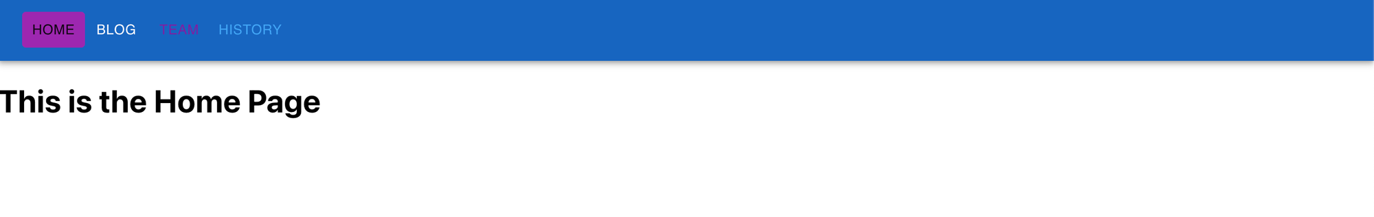
Changing the AppBar style
The AppBar component can be styled directly using the sx prop. For example, we can change its background color like this:
The bgcolor is set to the dark variant of the primary color from the theme:
Changing the navbar button style
The Button component can also be styled using the sx prop. For instance, we can change the color of the button when it's selected:
The button is selected when the pathname is /. In this case, the button changes its background color to the main variant of the secondary color from the theme:
Changing the text style
The button text can also be styled using the sx prop. For instance, we can change the color of the text like this:
In this example, the text color is set to the primary text color from the theme:
The sx prop offers great flexibility for styling components. It enables us to swiftly and directly apply custom styles to components. To learn more about the sx prop, take a look at the official MUI documentation.
You can find the code used in this article in this GitHub repository.
Although Material UI is a powerful library for users to build UIs, it has several limitations. It can be difficult to customize, isn’t highly intuitive, and can have some performance issues. Luckily, there is an easy-to-use solution that can be highly customized to build powerful UIs.
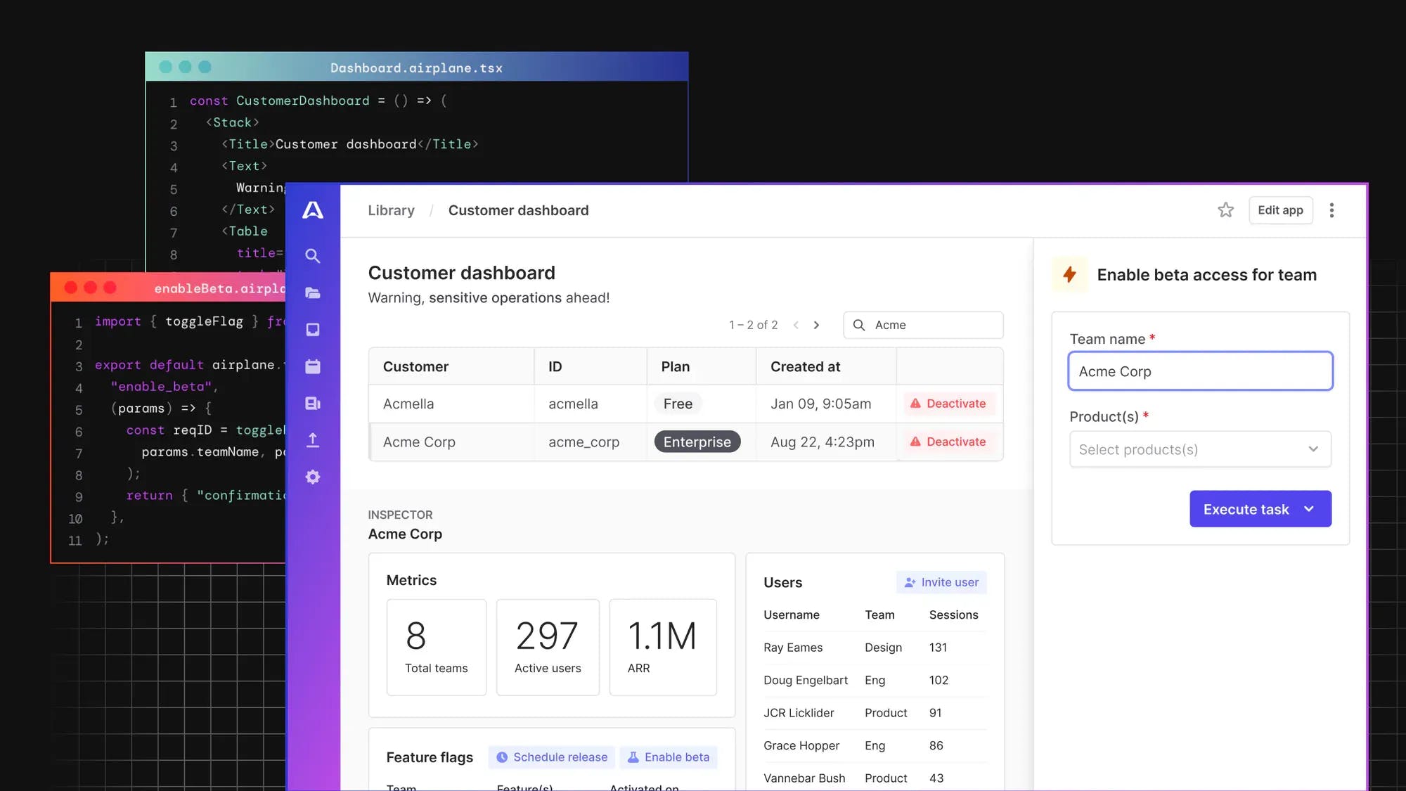
Introducing Airplane Views, an easy-to-use platform for building custom UIs
Airplane is the developer platform for building custom internal tools. With Airplane, users can transform scripts, queries, APIs, and more into powerful workflows and UIs. Airplane Views is Airplane’s React-based platform for building custom UIs.
Airplane offers powerful out-of-the-box components and templates that makes it easy to get started. You can also easily build custom components or use third-party libraries, making it simple to build UIs that fit your organization’s needs.
In addition to component and template libraries, Airplane offers strong defaults, such as audit logs, permissions settings, and approval flows.
Author: Lucien Chemaly
Lucien has nine years of software engineering and technical leadership experience. He has worked on an led various projects, including building SCADA platforms, building SaaS solutions for the United Nations (WFP), and migrating old structures (monolithic applications) to the latest architecture (eg, microservices, Docker, Kubernetes, CI/CD).
