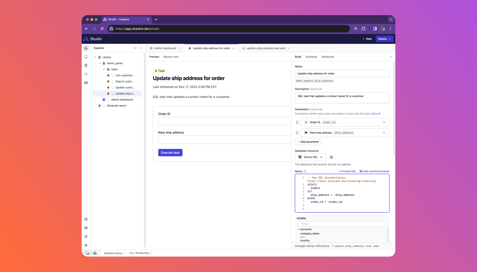
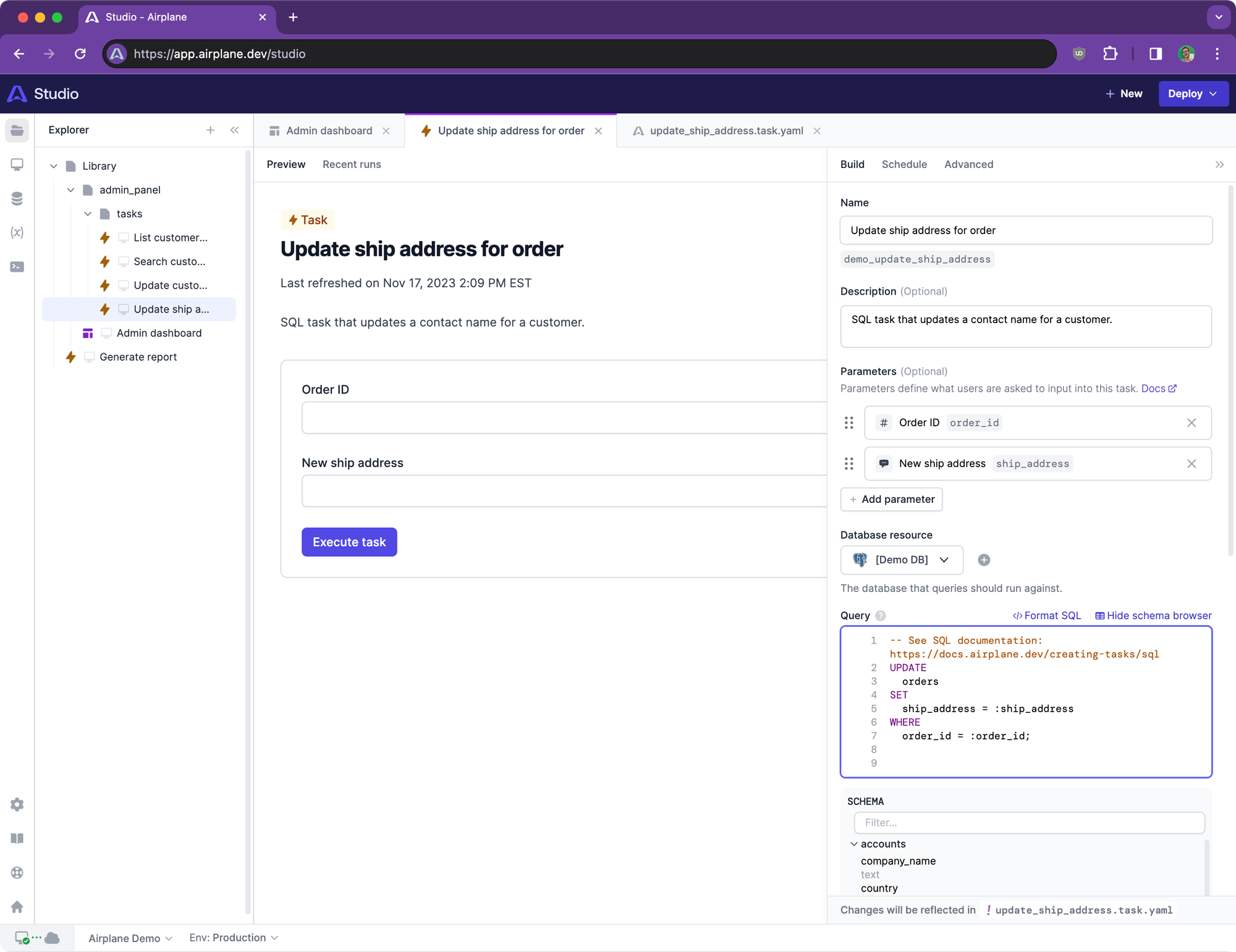
Today, we’re rolling out an updated UI for Airplane Studio. We’ve been dogfooding this UI internally and have found it significantly improved the usability of Studio.
Background
Over the past year, Studio has grown from a simple previewer for Views to a full-featured development environment for Tasks, Views, and Pages. We’ve introduced new features and functionality over time, but reached a point where these changes feel tacked on rather than cleanly integrated into a holistic experience.
Our design and engineering team set out to improve the Studio UI with an eye for the whole system and how it works together. We wanted to refine how builders navigate through Studio and increase the information density while improving overall legibility and hierarchy.
What changed
Overall, we’ve polished many of the UIs and interactions within Studio. However, there are a few significant changes that we want to call out.
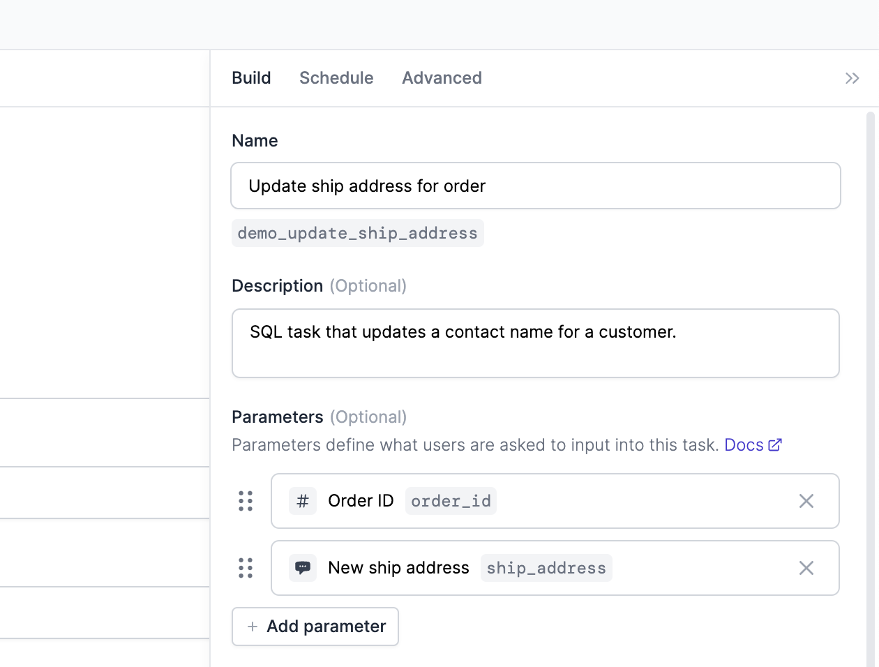
First of all, the UI for editing task and view configuration has moved out of the horizontal debug panel into a vertical inspector.
We’ve introduced a footer to Studio and moved the dev server connection status, team select, and environment select inside.

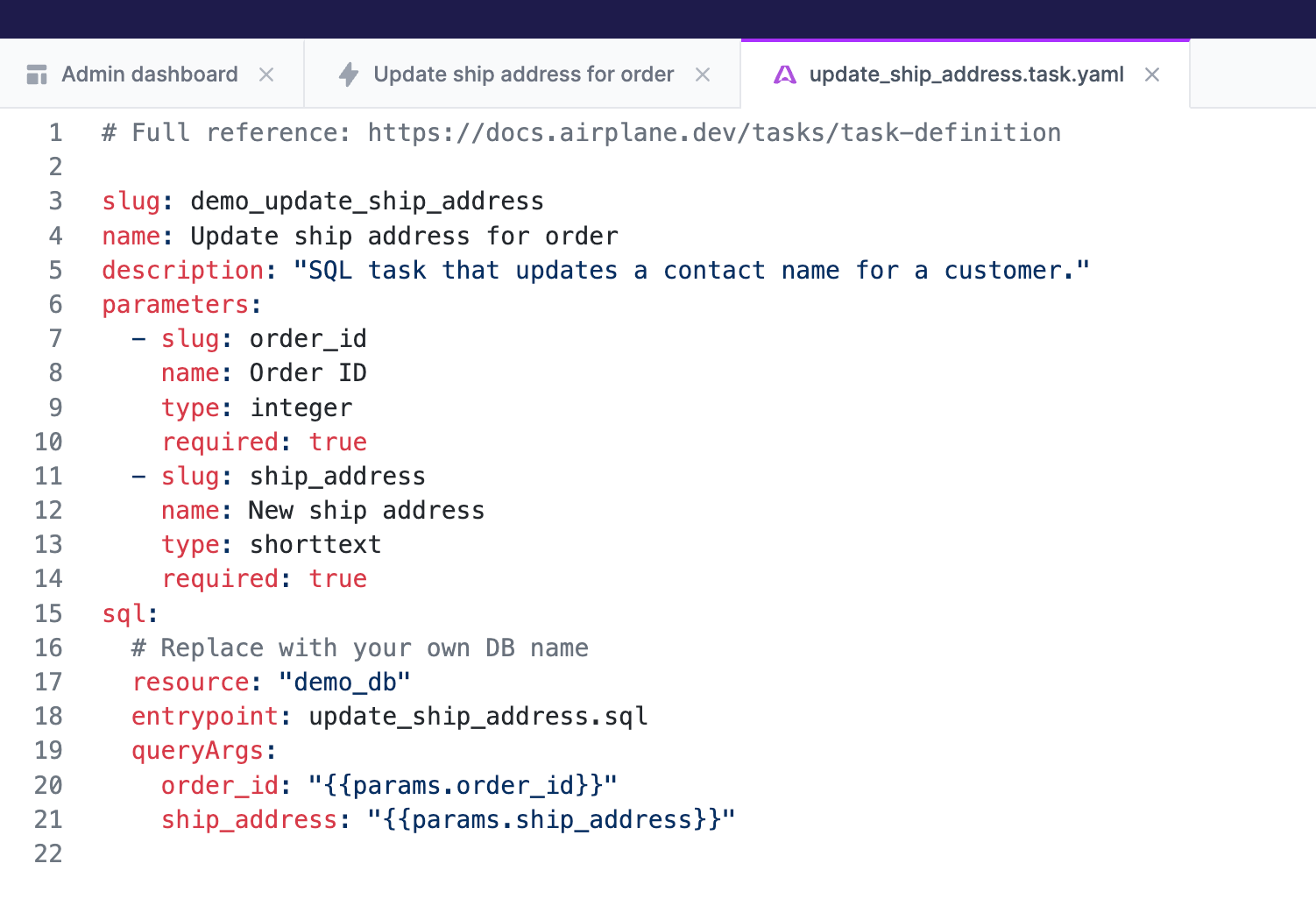
Previously, task and view tabs were rendered in a separate pane from code tabs. These are now unified into a single panel to give you more room to work with! Soon, we’ll support splitting the editor panel to make context-switching even easier.
We’ve introduced a navigation bar to Tasks, Views, Pages, and Runs which makes it easier to navigate around Studio.
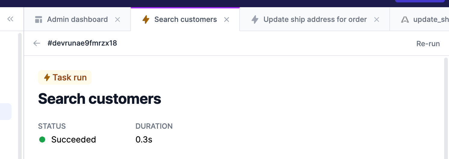
Finally, the Studio is now entirely rendered under /studio and the URL path no longer updates as you navigate between entities. This change makes navigating between content snappier and supports the new tab system.
If you have any feedback, we’d love to hear it — just send us a note at [email protected].


