

This article is not about compliance requirements, RBAC, SSO, etc. If you're interested in that, check out EnterpriseReady.io.
However, having every box checked on that website still won't result in a high-quality enterprise product. Deeper enterprise design moves past the superficial requirements and understands the different needs and workflows of larger organizations. Products that perform great for small teams often become a complete mess when a lot of people try to collaborate in a single account.
At Airplane, we're building a product intended for both small startups and large enterprises. I previously co-founded Heap, a product analytics company that sold to a similar spectrum of customers. And my co-founder previously was CTO at Benchling, a life sciences SaaS company that sells to biotech startups and massive pharma companies.
Both of us have experience building enterprise software that works for large teams, and here are some of the ways we've achieved that.
At-Scale Organization
One of the main ways that a good product fails to scale to a larger enterprise is a lack of effective ways to organize things. Many SaaS tools allow users to create things–e.g. analytics tools like Heap or Looker let users create reports, tool builders like Airplane let users build apps, Figma lets you create files, Airtable lets you create "bases," etc. These things are the units of collaboration within the app.
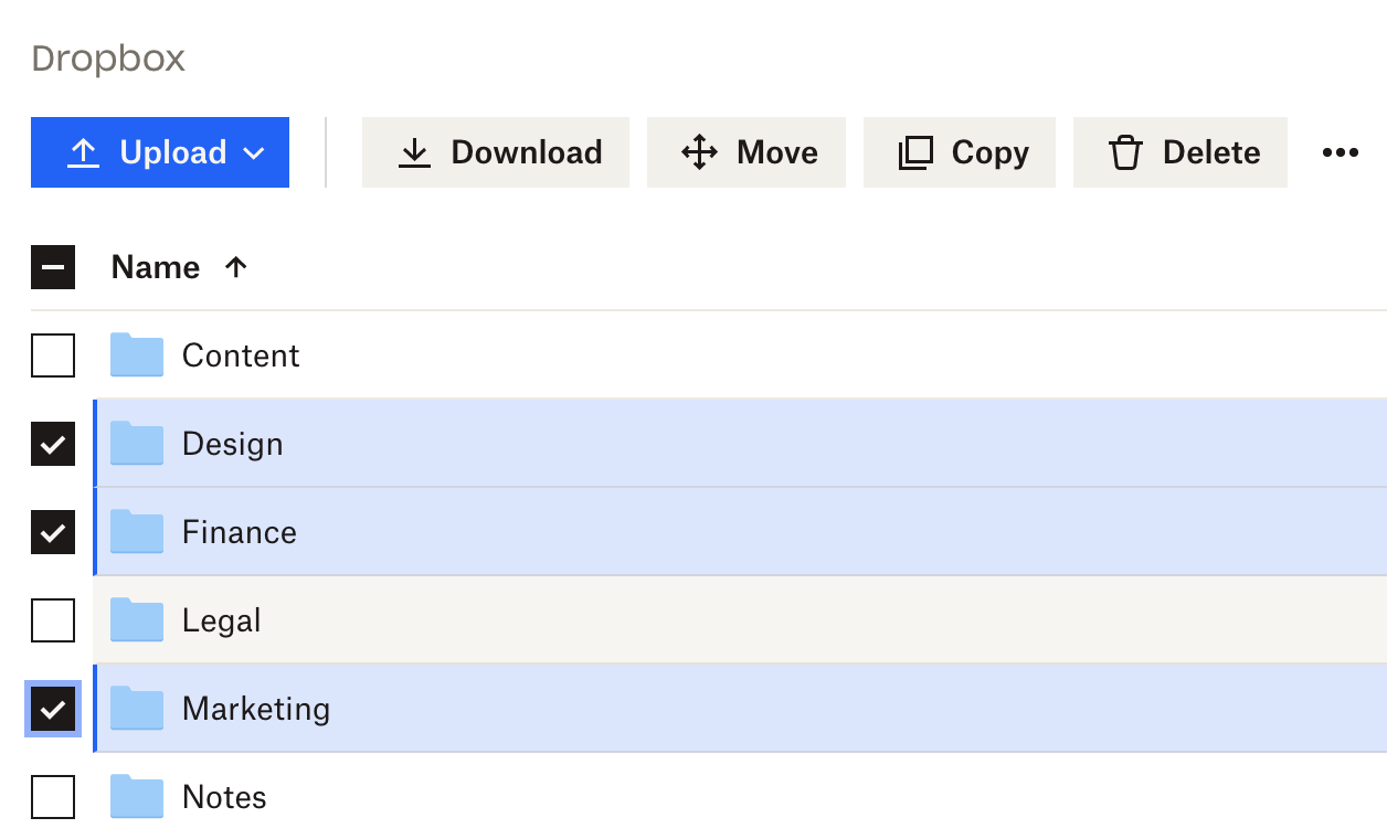
For an individual or a small team, throwing everything into a list or grid view is perfectly fine. If your 10 person product team has 30 total reports in your Heap account, it's alright to just show an alphabetically sorted list, and that's exactly how we started out at Heap. But at enterprise scale, this breaks down quickly. There are Heap accounts with several hundred active users and thousands of reports. So this is what the report viewer looks like now:
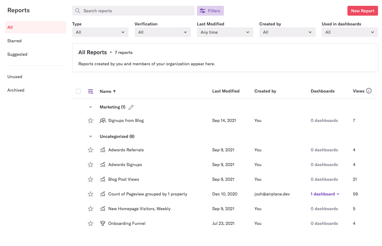
Over time, Heap added several key organizational features:
- Folders: This is one of the first things a product should think about adding as the number of things that people are collaborating on exceeds ~20. If n=20 items starts to get unwieldy, folders let you scale to n^2 = 400 items before the folder cardinality itself becomes unwieldy and you need to layer on nested folders, tags, or other organizational constructs.
- Search: Heap has keyword search to lookup reports. This alone wouldn't be enough, since report titles are short and have a lot of redundant words with other report titles. But in order to better support search and disambiguation, Heap also added descriptions and notes that can be attached to reports (not pictured above).
- Verification: Heap, and tons of other modern SaaS, optimizes for ease of use, accessibility to a wide range of users, and fast time-to-value. The flip side of this focus is that it's really, really easy for people to create useless or half-baked stuff. Heap added a feature that allows admins or other high-level users to verify reports that meet a bar of accuracy and quality. This feature is completely ignored at small and mid-sized Heap customers but indispensable for enterprises.
- Filters: This helps narrow down the search set quickly. If you can't remember the exact name of a report but you know who made it, or if you just want to narrow down to verified reports only, you can use filters.
- Analytics: Heap is an analytics company–of course we track how many times each report is viewed. Showing just that simple stat (along with when a report was last modified) goes a long way towards disambiguating an up-to-date daily signups chart from an out-of-date version.
A good place to look for design inspiration for how to organize a product at scale is Wiki tools like Slab or Notion. The cardinality of documents in even a very small company is so high that strong organization features need to be introduced early. In our 8-person company's Slab account, we're already making use of nested folders, search, and favorites.
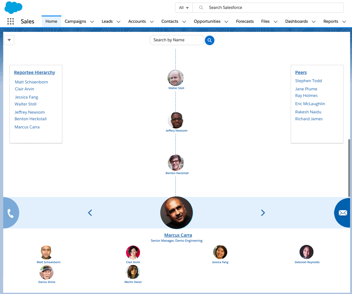
In some SaaS platforms, the natural unit of organization is an employee. For example, in Salesforce, opportunities and accounts are naturally organized by the sales or customer success person to whom they're assigned. The cardinality of accounts for any one person is rarely large enough to require folders or search for that person to stay organized.
Even then, for a manager or leader in that organization, at enterprise scale, this isn't sufficient. If your company has 1000s of sales reps, a flat list of reps isn't helpful. So instead, enterprise tools like these let you model an org chart.
Bulk Actions
As your product accrues more stuff, you will also need to be able to do stuff to your stuff in bulk. Analytics tools pile up reports tracking feature usage on features that no longer exist, wikis accrue docs on out-of-date policies and procedures, and so on.
A lot of products have workflows where to delete or archive something, you have to open the thing first (e.g. open a file), click "delete," and then a popup comes up asking "are you sure?" Totally fine if you're deleting one thing. Incredibly frustrating if you're trying to delete 100 things.
Some of the most common bulk operations that come up:
- Bulk delete
- Bulk rename
- Bulk copy/duplicate
- Move lots of things between folders or teams
- Adding lots of users at once (e.g. during initial rollout to your 10,000 person org)
Building bulk functionality into a product is complicated. There's a few issues to keep in mind:
- Danger: Bulk actions are not something you want people to do accidentally. If there's a single checkbox that selects everything, and then a single button that irreversibly deletes all those things, that's the equivalent of making it really easy for someone to accidentally run an
updateordeletewithout a where clause. - Permissions: it's much easier to build a UX around permissions for a single object than many simultaneously. For example, let's say you need to handle cases where a user has delete permissions on some but not all of the selected items–is the "delete all" button just greyed out in this circumstance? How do you indicate to the user what they need to deselect to allow access to that operation?
- Performance: poorly thought-out bulk actions are a great way to trigger a massive reindex for your systems, a very slow UI, or hundreds of inadvertent Slack or email notifications.
Before building bulk actions into a product, many enterprise products instead use the customer success or support team as the interface to these. For example, it's common to have a customer onboarding process where you send a spreadsheet to your implementation rep with a list of employees, and they use some internal tool or script to import all those users in bulk (this is a common use case for Airplane).
This is perfectly fine for an early-stage product, but it's a bit overdue when products doing $100M+ in revenue still use the "CSV-to-CSM" interface for common bulk actions.
High-cardinality UI elements
Another thing to keep in mind is that many things degrade poorly as the cardinality increases. Above we saw the approach of using folders, search, etc to organize things better. A related, more subtle product consideration is making sure that UI elements like dropdown menus work well at scale.
For example, you might initially have a static dropdown menu for adding teammates to a shared folder. This works fine if you have a few dozen people in your account. If there are hundreds, or thousands, this is a mess (and might even run into client-side performance issues if you're not careful).
Pitch.com does a good job of this in their "share folder" flow:
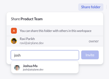
Instead of a static dropdown, they use search and autofill. They also include a lot of contextual information in each search result–the name, email, and avatar of the user–so in a large org where there might be a lot of people named "Josh," you have an easier time narrowing down who you're looking for.
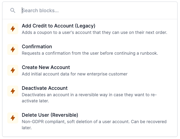
We take a similar approach in Airplane. In this UI element, instead of a simple dropdown to select a task, we use a search box that includes contextual information like the task description:
The considerations above are a small slice of what you have to consider when building a high-quality enterprise product. They may not even be relevant to the app you're working on. But the main idea here is to think through how your app will look and feel when being used by hundreds or thousands of people. Often, the environments in which people test things internally have a small amount of demo data and don't accurately represent the enterprise user experience.