


Recently, I was looking at this graph of the number of weekly active users using Airplane each week over the last few months of 2021:
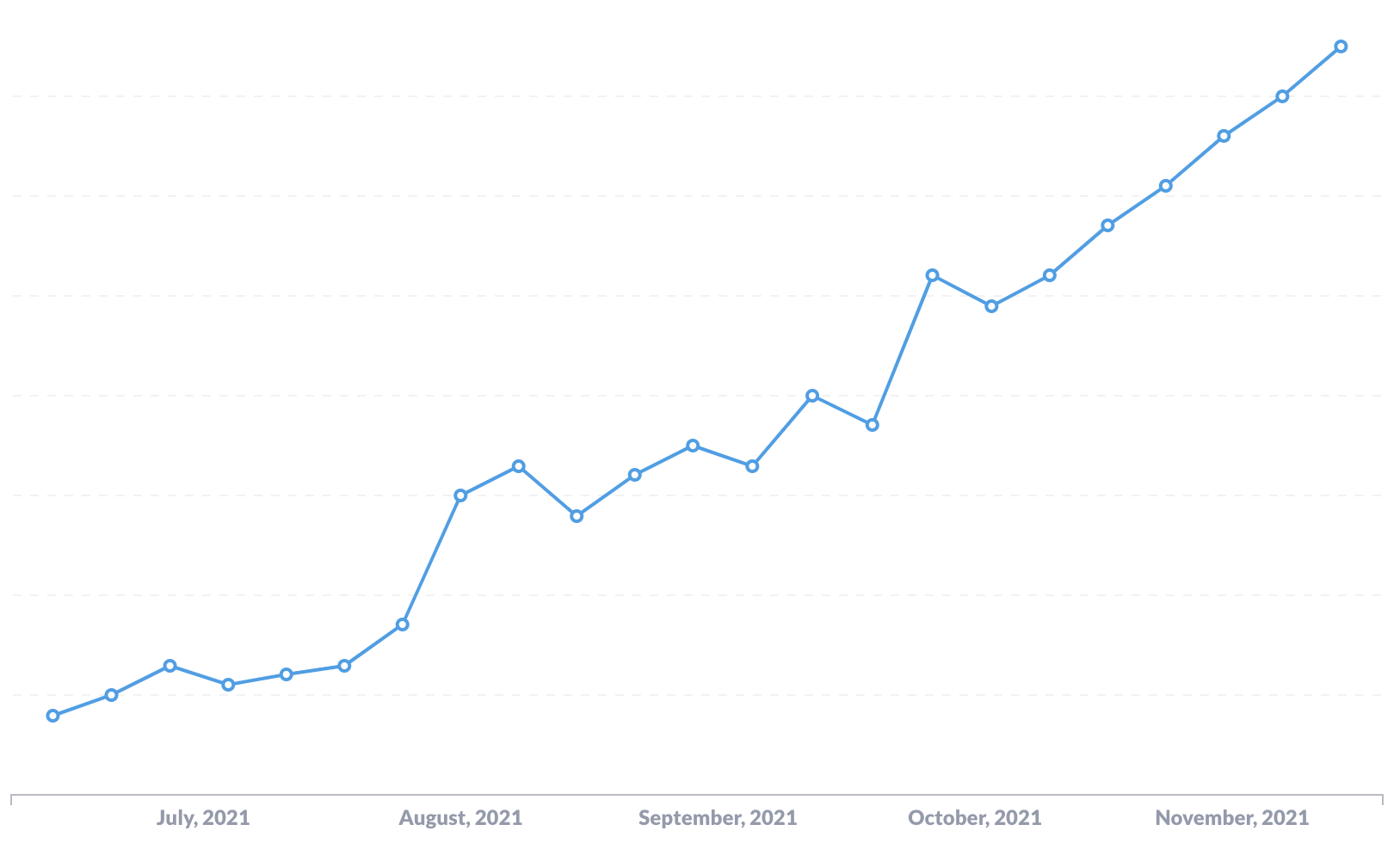
To me, it looks like boring, linear growth. We're adding roughly the same amount of new active users each week. But this was really surprising to me. I knew for a fact that we had a big inflection point in growth towards the end of September when a blog post of ours did really well on HN, LinkedIn, etc. It led to a one-time big spike in signups and a sustained higher rate of growth afterwards.
I already knew this before I made the graph, which was one reason I was surprised when it looked linear and decided to dig in a bit further.
Look at the graph again with trendlines overlaid:
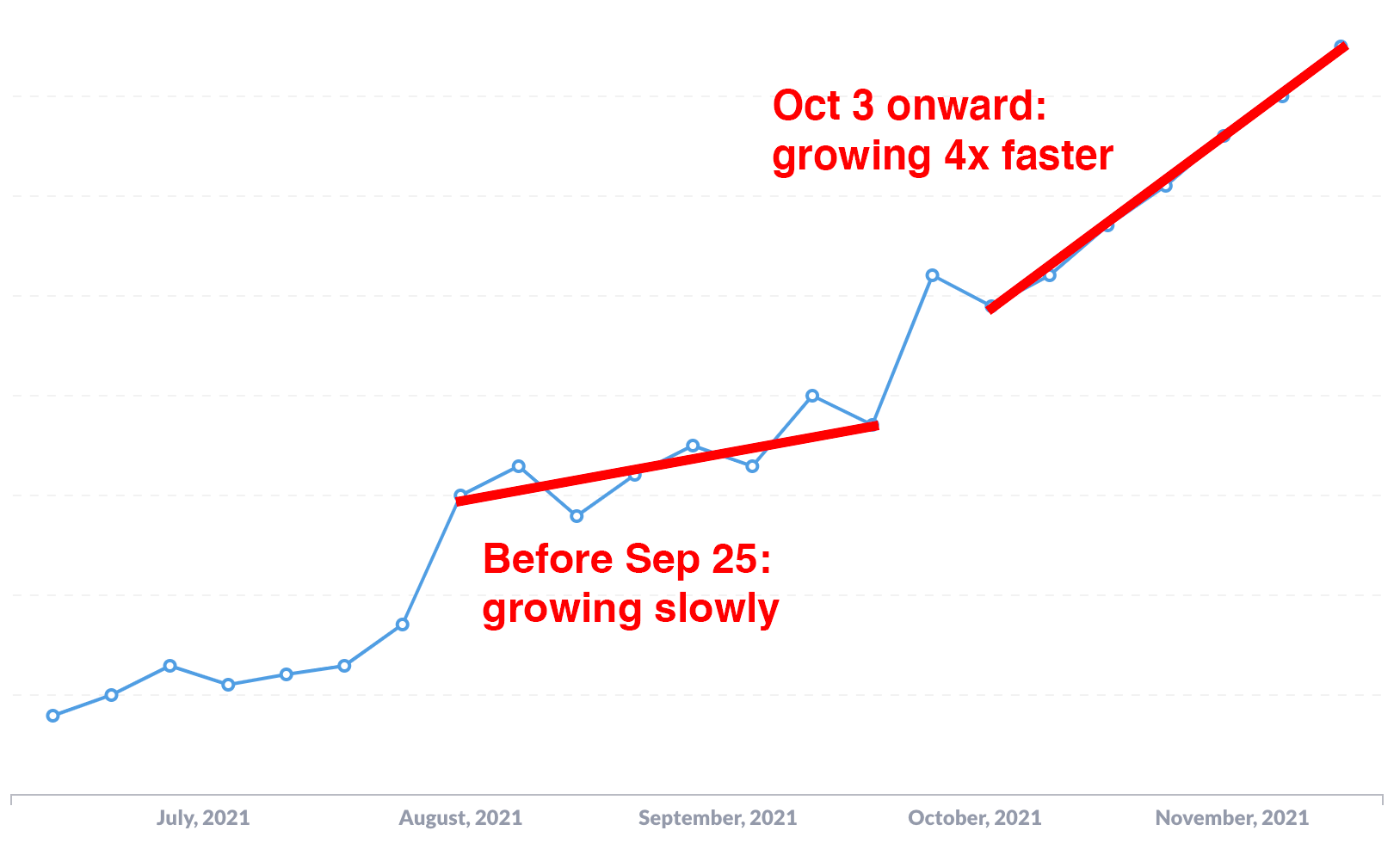
We added more than 4x as many new users each week in October and November as we had in August and September. This is not at all obvious when glancing at the graph without trendlines.
Our ability to perceive differences in slope is weak compared to things like differences in length or position (Cleveland and McGill, 1986). If you're trying to tell whether the rate of something is changing over time, plot the rate directly. Create a graph where each bar or dot represents the change in X from the previous time period, rather than the total count of X in each time period. If we do this with our graph above, we get something more like this:
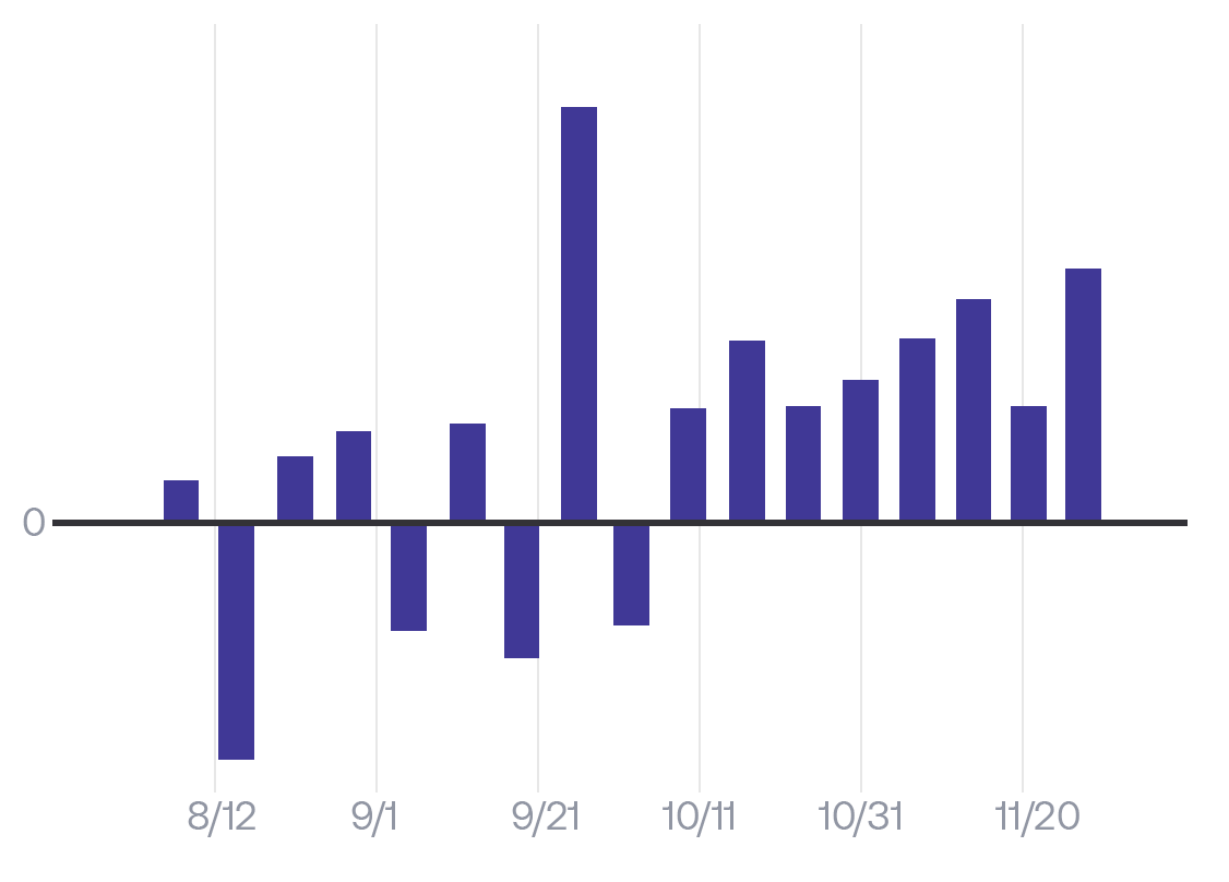
In this graph, it's clear that in the first half, the change in active users was fluctuating above and below 0 each week. But after late September, the change in active users was consistently positive each week. It's not clear that it's a 4x difference, but it provides a clear signal to dig in and look at the data directly.
If you're trying to compare two quantities, use data visualization techniques where those quantities are represented by easy-to-compare things like bars, rather than hard-to-compare things like slopes of lines.